.png)

 Posts
Posts





.png)
.png)
Every now and then, even this squirrel will catch a nut. My "call" on the Dollar Index on January 19 has been prescient, and it appears that the Dollar can still move higher as key price levels (i.e., resistance) continue to fall. See figure 1, a weekly chart of the Dollar Index.
Showing posts with label Gold/ Dollar. Show all posts
Showing posts with label Gold/ Dollar. Show all posts
Friday, February 19, 2010


Wednesday, January 20, 2010
Some Interesting Reading
Here are several articles that I have read over the last two days that I thought were noteworthy.

As A Corollary To A Higher Dollar....GLD, GDX, SLV
As a corollary to a higher Dollar, it is my expectation that precious metals will be under pressure.
Tuesday, January 19, 2010
Expecting the Dollar Index To Rise For 2010
In 2009, investors were down on the US Dollar, and anytime the US Dollar was down, everything else was up. But as we head into 2010, the US Dollar appears to have found support above the all time lows made around $70 in March, 2008 and reversed higher. There is reason to believe that from a technical perspective this reversal is for real, and it is real enough that it should have implications for other markets.
Friday, January 8, 2010
This Correlation Still Exists
As you all know, there has been a tight correlation between the US Dollar Index and equities for the better part of 9 months. If the Dollar goes down, then equities go up. Even if there is a hint that the Dollar might go down - let's say, a bad employment report suggesting that the Fed will keep its foot on the monetary pedal even longer- stocks go up. We all have the drill down. The Fed throws us a biscuit, and we all stand up and bark!
Sunday, January 3, 2010
Wednesday, December 16, 2009
Dollar Index: TheTechnicalTake
Figure 1 is a weekly chart of the Dollar Index (symbol: $DXY). In our last look at the greenback I stated: "in all likelihood, this is the end of the down trend for the Dollar Index", and this is now fact! A weekly close over the high of the positive divergence bar (i.e., price bars marked in pink within gray ovals) has stymied the down trend. The highs of these positive divergence bars should act as resistance on the way back up.
Monday, December 14, 2009
Headwinds Abate Slightly
Last week the price of crude oil lost almost 10% pushing our composite indicator that is constructed from the trends in gold, crude oil and yields on the 10 year Treasury back below the extreme line. See figure 1 a weekly chart of the S&P500 with the indicator in the lower panel.
Monday, December 7, 2009
The Technical Take: Dollar Index
It's Monday, and there is no better place to start the week with the only asset that has mattered for the past 8 months - the Dollar. Although Friday's job report brought a spike in the Dollar Index, the down trend remains intact. However, the likelihood of the downtrend ending leading to a counter trend rally or consolidation is now as high as it has been in months.
Wednesday, December 2, 2009
The Only Chart That Matters
How could I forget the only chart that matters?
Figure 1 is a weekly chart of the Dollar Index. This is the same chart I have been showing since June, 2009 - prior to the Dollar Index unraveling. Last week there was a weekly close (price bar with down red arrows) below the low of the immediate positive divergence bar at 75.20. Closes below positive divergence bars (price bars highlighted in pink with gray oval) tend to lead to selling as traders expecting a reversal close out their losing positions. The down trend continues, and as the data shows, there is a high likelihood of the downward move accelerating.
Monday, November 9, 2009
Dollar Index Technicals
Figure 1 is a weekly chart of the US Dollar Index (symbol: $DXY). The pink labeled price bars within the ovals are positive divergence bars.

Figure 1. $DXY/ weekly

The US Dollar Index remains in a downtrend. However, a weekly close above 76.58, which is the high of the recent positive divergence bar, would nullify that down trend, and in all likelihood, the Dollar Index would trade in a range. A close above the pivot at 79.46 would turn the down trend into an uptrend.
A weekly close below the low (75.20) of the current positive divergence could lead to an acceleration of the down trend as those anticipating a trend reversal give up their losing positions. This is the "this time is different" scenario but in reverse.
Some of the prior articles on the Dollar Index, which explain some of the strategies that I use to arrive at these conclusions, are located here:
The technical picture for the Dollar Index is pretty straight forward. And while "everything under the sun" goes up when the Dollar goes down, it is still my contention that commodities will out perform equities if only because in this liquidity driven environment equities will be prone to sudden sell offs. As a reminder, you may want to review the article "The Inflation Indicator Meets The "Dumb Money" Indicator".
Sunday, November 1, 2009
Dollar Technicals
Figure 1 is a weekly chart of the US Dollar Index (symbol: $DXY). The pink labeled price bars within the ovals are positive divergence bars.
Figure 1. $DXY/ weekly 

The US Dollar Index remains in a downtrend. However, a weekly close above 76.58, which is the high of the recent positive divergence bar, would nullify that down trend, and in all likelihood, the Dollar Index would trade in a range. A close above the pivot at 79.46 would turn the down trend into an uptrend.
Some of the prior articles on the Dollar Index, which explain some of the strategies that I use to arrive at these conclusions, are located here:
(September 18, 2009)
(August 21, 2009)
While the technicals from my perspective are pretty straightforward, the question remains what impact will a higher Dollar have on equities and commodities. The common assumption is that a higher dollar can only mean one thing: a flight to quality as the reflation or risk trade is over. I am not sure that is going to be the case here. Equities do look weak as many sectors have been breaking down over the past month, but gold and crude oil still look very strong despite the recent market turbulence. So if we do get that higher Dollar, it will be interesting to see how the commodities react versus equities.
Tuesday, October 6, 2009
Dollar Index: The Technical Take
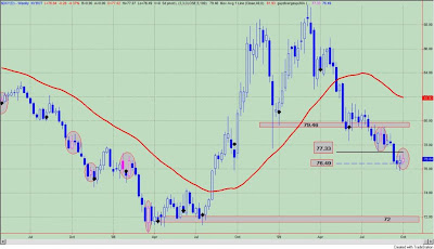
Let's get technical on the Dollar Index (symbol: $DXY). A weekly chart is shown in figure 1.
Figure 1. Dollar Index/ weekly


The price bars in blue represent positive divergence bars between price, which is heading lower, and a momentum based indicator used to measure price, which is heading higher. Positive divergences generally represent slowing price downside price momentum and often are a harbinger of a change in trend. In other words, traders position themselves for a possible trend reversal at the presence of these positive divergence bars.
But what happens if the reversal never comes? What happens if the market trades below the lows of these positive divergence bars? Just like we see an acceleration of higher prices to the upside with negative divergence bars - see the article on the "this time is different scenario" - we can also see an acceleration of prices to the downside as traders unwind losing positions.
So that is what is at stake for the Dollar Index here. I wrote about this technical set up in the article "This Time Is Different (In Reverse)". When there is a close below the low of a positive divergence bar in the Dollar Index, losses can accelerate. If this were to occur, prices are likely to fall to the April, 2008 lows around $71 to $72.
So let's summarize. A weekly close below the lows of the positive divergence bar at 76.49 is likely to lead an acceleration of prices lower. A close above the highs (77.33) of the positive divergence price bar would result in the down trend being stymied. A weekly close above the pivot low point at 79.46 would likely result in a new up trend.
Monday, October 5, 2009
Gold v. Currencies
Figure 1 is a concept that I have put forward before, and it is gold's performance relative to a basket of 8 currencies.Those currencies are: 1) Australian Dollar; 2) Canadian Dollar; 3) Swiss Franc; 4) Eurodollar; 5) British Pound; 6) Singaporean Dollar; 7) Japanese Yen; 8) US Dollar. This is a weekly chart.

Figure 1. Gold v. Currencies/ weekly

Relative to other currencies, gold continues to outperform. The red vertical line was the first positive reading from the indicator after about 10 months of being negative. This was 10 weeks ago and gold was trading at $960 an ounce.
Wednesday, September 30, 2009
This Sounds Familiar
There is a strong trend. Negative divergences in an up trend or positive divergences in a down trend (between price and momentum oscillators that measure price) begin to show up on the weekly charts. Traders position themselves for a trend reversal as the divergences are indicative of slowing momentum. The reversal never comes, and the trend continues in the same direction often times accelerating as traders bail out of losing positions.
Sounds familiar? We have seen this in equities this year as prices bolted higher in mid July, and we have seen this in the Dollar Index as a continuation of the down trend that started in April. This is the "this time is different" scenario.
So what is the big deal? Well our key asset, the Dollar Index, is forming a positive divergence on the weekly charts. See figure 1, a weekly chart of the Dollar Index.
Figure 1. Dollar Index/ weekly

Positive divergence bars between a momentum oscillator that measures prices and price itself are highlighted by the pink prices within the gray oval. As can be seen, closes above these price bars led to an intermediate trend reversal or a close below the lows of these positive divergence bars resulted in an acceleration of the trend lower.
So with the positive divergence in place on the weekly, a close above the highs (77.33) of this price bar would result in the down trend being stymied. A close below the lows (76.49) of this positive divergence bar would likely result in an acceleration of the downtrend as traders cover their losing positions. (Anecdotally, much of my email recently has suggested that many traders are positioned for a reversal in the Dollar Index, so we shall see if "this time is different".) In any case, this acceleration of prices could come to fruition as there is very little support between current prices and the lows seen in April, 2008.
Lastly, a weekly close above the pivot low point at 79.46 would likely result in a new up trend.
And one final note: The Dollar Index -that same key asset to follow - that has been driving returns in both equities and commodities is down today. Surprisingly, equities are down too. Commodities will remain the beneficiary of a falling Dollar. Equities should start to struggle in such an environment as inflationary concerns (real or perceived mount) and the notion that no country has ever devalued its way to prosperity takes hold.
Friday, September 18, 2009
The Dollar Index: The Trend Is Your Friend
In identifying the Dollar Index (symbol: $DXY) as the key asset class to watch, I relied upon two strategies for guidance to make the call on June 19, 2009 that that this was a "Very Dangerous Time For The Dollar Index". So far, things are working out as expected.
The first strategy sold the Dollar Index short on any close below 3 pivot low points. Positions were covered on a close above 3 pivot lows or a close greater than the 40 week moving average. The second strategy sold the Dollar Index short on any close below a positive divergence bar. Positions were covered on a close above a positive divergence bar or a close above the 40 week moving average. In both strategies, weekly data were utilized.
Both strategies identified price patterns that suggested the Dollar Index would fall and there would be a high likelihood that that fall would be significant. In the first strategy, the average trade lasted 23 weeks, and in the second strategy the average trade lasted 14 weeks. The discrepancy in the average trade length was due to the fact that prices really accelerated lower on closes below positive divergence bars as traders looking for a bottom throw in the towel to cover losing positions. This trade or the second strategy made its gains, which were almost equal to strategy 1, over a much shorter time frame.
With regards to the first strategy (i.e., close below 3 pivots), the sell signal has been in effect for 8 weeks. For the second strategy (i.e., close below positive divergence) the sell signal has been in effect for 4 weeks. So what is my point? This weak dollar trade has yet to reach an average duration in time. In the Dollar Index, the trend is still your friend until it ends.
Reinforcing this notion that the down trend in the Dollar Index could persist for longer than most expect, there is an editorial from Bloomberg entitled, "Hedge Funds' ATM Moves From Tokyo to Washington: William Pesek". The writer basically argues why the Dollar Index will remain lower than many of us think. Essentially, a higher Dollar risks another episode of deleveraging. As Pesek points out:
"Think about the turbulence that would be unleashed by the dollar suddenly shooting 5 percent or 10 percent higher with untold numbers of traders around the globe on the losing side of that trade. It could make the “Lehman shock” look manageable."
In essence, the Federal Reserve and Treasury have a lot at stake and will likely continue the policy of devaluing the Dollar.
I want to thank Trader Mark at FundMyMutualFund for bringing this article to my attention.
Thursday, September 3, 2009
Silver v. Currencies
Figure 1 is a weekly chart of a continuous silver contract. The indicator in the lower panel measures silver's 52 week performance relative to a basket of 8 currencies.Those currencies are: 1) Australian Dollar; 2) Canadian Dollar; 3) Swiss Franc; 4) Eurodollar; 5) British Pound; 6) Singaporean Dollar; 7) Japanese Yen; 8) US Dollar. Relative to these currencies, silver is outperforming. Over the past decade, such outperformance led to significant gains in the price of the metal.

Figure 1. Silver v. Currencies/ weekly

Friday, August 21, 2009
This Time Is Different (In Reverse)
In past articles to explain the price action, I have defined the "this time is different" scenario. For example, at market tops we typically see negative divergences between prices and momentum oscillators that measure price. These negative divergences are indicative of slowing upside momentum and a point where traders are likely to look for the market to rollover. If prices continue to move higher despite the presence of these negative divergences, often times we find investors saying "this time is different" as prices accelerate much higher. Of course, I think the acceleration in prices is due to short covering as traders who where expecting the market to rollover are now forced to cover their positions.


The "this time is different" scenario can also work in the other direction too. At market bottoms, we often see positive divergences between price and momentum oscillators that measure the price action. As downward momentum slows (i.e., presence of positive divergences), traders will position themselves for the market to reverse and move higher.
What happens if the market doesn't reverse? What happens if the market trades below those positive divergence bars? Just like we see an acceleration of higher prices to the upside, we can also see an acceleration of prices to the downside as traders unwind losing positions.
Why is this relevant? It appears that the Dollar Index, which is our key asset class that is driving all other assets, has closed below the low of a positive divergence bar, and this is a negative for the Dollar. See figure 1 a weekly chart of the Dollar Index (symbol: $DXY). Positive divergence bars are labeled with the pink markers inside the gray ovals on the price chart. The low of the most recent negative divergence bar is 78.23, and today's close is 78.08.
Figure 1. Dollar Index/ weekly

So let's ask a very simple question: what happens to prices when there is a close below the low of a positive divergence bar? To understand the dynamics at work here, we will construct a simple strategy:
1) sell short the Dollar Index on a weekly close below a positive divergence bar
2) buy to cover on a close above the 40 week moving average
3) buy to cover on a weekly close above the high of the positive divergence bar
4) slippage and commissions were not considered in the analysis.
Remember, this is the reverse of the "this time is different" scenario.
Since 1973, such a strategy had yielded 50 points in the US Dollar Index; buy and hold would have netted minus 18 points. There were 25 trades and 68% of these were winners. The average time in all trades was 14 weeks with winning trades lasting 18 weeks. Figure 2 is the equity curve from this strategy. Maximum equity curve draw down is about 25%, and the RINA Index, which measures trade efficiency (i.e., points gained v. time in market v. draw down), is a very high 248.
Figure 2. Equity Curve

To get an idea how significant the down draft may be in store for the Dollar Index let's look at the maximum favorable excursion (MFE) from this strategy. MFE measures in percentage terms how far a trade can go in your favor before it is closed out for a loss or a win. For example, look at the MFE graph from this strategy in the Dollar Index. Remember we are shorting the Dollar Index here. See figure 3. The green caret within the blue box represents one trade. This trade ran up about 4% (x-axis) and was closed out for a 1% gain (y-axis). We know this trade was a winner because it is a green caret.
Figure 3. MFE Graph

Out of the 25 trades from this strategy, 6 (or 25%) ran up greater than 9%; this is to the right of the blue line. 60% (15/25) of the trades ran up over 5%; this is to the right of the red line. So there is a 60% chance of getting a 5% move lower in the Dollar Index.
How does this set up - a close below the low of a positive divergence bar - compare with the strategy discussed in the article "The Dollar Index: Key To Market Dynamics"? In that strategy, a short position was taken on a weekly close below 3 pivot low points, and this strategy gave a signal 4 weeks ago.
Comparison probably isn't the right word here. Rather, the current strategy is probably best viewed as a continuation of the prior strategy. Both strategies have the potential to see the Dollar Index really unravel; this we know. In both cases, 25% of the trades had large MFE's; in both cases, over 60% of the trades had MFE's greater than 5%.
But here is the kicker: the current strategy sees those gains occurring over an 18 week time frame. Whereas the prior strategy, sees those gains occurring over a 65 week period. In other words, when there is a close below the low of a positive divergence bar in the Dollar Index, losses can accelerate. This leads to more efficient gains (i.e., if you are betting against the Dollar Index) as you make more money with less market exposure. As expected, the RINA Index, which is a measure of trade efficiency, is 30% higher with this strategy than with the original strategy.
So the current set up is like the "this time is different" set up but in reverse.
So let's briefly stop and summarize. The Dollar Index has closed below the low of a positive divergence bar, and I am expecting prices to accelerate lower over the next 4 months. A weekly close above the pivot low point at 79.46 would be a reason to re-evaluate this position.
To be complete in our analysis, the maximum adverse excursion (MAE) graph is shown in figure 4. If a trade lost (or had a draw down of) more than 2.5%, it had a high likelihood of being a losing trade. These are the trades to the right of the red line.
Figure 4. MAE Graph

So if the Dollar is going down, then everything else must be going up. At least, that is how it is working these days. Dollar down, equities get a lift; stocks rally on good news and bad as it doesn't matter. The Dollar is down! A down Dollar is good for commodities too; oil was up 4 days in a row. Even good old Treasury yields have benefited. Forget about equities, the 10 year Treasury yield was up 3.41% today. Yeah, it is sad, but it is what it is!
As far as equities are concerned, well I am starting to sound like a broken record: the market is overbought, oversubscribed (i.e., too many bulls) and has limited upside potential. "Where do we go from here?" is a refrain I often ask myself, and I am starting to think about what happens when investors rush for the exits. From a reward to risk perspective, this isn't my "cup of tea". The market remains range bound albeit we are at the upper limit of that range.
If the Dollar Index continues its downward spiral, then I would expect commodities, gold, and long term Treasury yields to out pace equities. As I have shown in the past, when the trends in these assets are strong, equities face a stiff headwind.
Wednesday, August 19, 2009
Asset Allocation Road Map: Update On Dollar Index
In our asset allocation road map for the next 12 months I stated the following:
"In a nutshell, I would have to state that I like commodities over long term Treasury yields and equities, and the key driver will be the falling US Dollar Index."
In this article, by PIMCO's Curtis Mewbourne, entitled, "Emerging Markets in the New Normal", he discusses the longer term headwinds facing the US Dollar. In particular, he states:
"And while we have not yet reached the point where a new global reserve currency will arise, we are clearly seeing a loss of status for the U.S. dollar as a store of value even in the absence of a single viable alternative. In combination with other factors, that likely means a continuing devaluing of the U.S. dollars versus other currencies, especially the EM currencies. Accordingly investors should consider whether it makes sense to take advantage of any periods of U.S. dollar strength to diversify their currency exposure."
Once again, I believe the Dollar Index will be the key asset to watch. In particular, a weekly close greater than 79.46 on the Dollar Index (symbol: $DXY) would be reason enough to re-consider this position. On the other hand, a weekly close below 78.23 could possibly lead to an accelerated move lower as those "fishing" for a bottom get out of their long positions.
Lastly, as promised, sometime in the future, I will provide you with insight -from a technical or price perspective - as to why I like commodities over equities and Treasury yields.
Thanks to the ZeroHedge blog for bringing this commentary to my attention.
Monday, August 10, 2009
The Dollar Index: Key To Market Dynamics
Over the next couple of weeks, I will attempt to put together an asset class road map that should help navigate the weeks and months ahead. In a nutshell, I would have to state that I like commodities over long term Treasury yields and equities, and the key driver will be the falling US Dollar Index.


Ever since I wrote the article "Very Dangerous Time For Dollar Index" on June 19, 2009, I have gotten several questions from readers about how I could be bearish on equities while maintaining bearishness on the Dollar. It seems to be a given that Dollar devaluation only leads to higher stock prices. While currency devaluation does lead to asset inflation, this can be too much of a good thing as inflationary pressures (real or perceived) will eventually begin to become a headwind for higher equity prices.
And this is what we saw in late June and early July, 2009. Inflationary pressures as measured by trends in commodities, gold, and yields on the 10 year Treasury bond remained strong and the market almost rolled over. Once these trends lost momentum, stocks reversed strongly to the upside over the past month. This pattern was pretty much repeated over and over again in the prior bull market for equities.
But I am ahead of myself. So let's first look at weekly chart of the Dollar Index (black line) versus S&P500 (blue line). See figure 1. For much of the late 1990's, stocks and the Dollar Index traveled together. These where the days when a strong Dollar and a strong economy and a strong stock market went hand and hand. This was prior to point 1 on the chart. At point 1, the historic multi-decade bull run for equities was over, and several years later at point 2 the US Dollar Index topped out as well. Both asset classes fell together and then equities bottomed at point 3. The Dollar Index continued lower for another 2 years finding a bottom at point 4. From the bottom in equities at point 3 in October, 2002 to the bottom in the Dollar at point 3 in December, 2004, the S&P500 gained 50%!!
Figure 1. Dollar v. S&P500/ weekly

After a wide trading range with an upward bias (for over a year), US equities sprinted higher starting in November, 2005. This is at point 5, and it also marked the highs for the US Dollar, which went on a downward path for over 2 years. In October, 2007 at point 6, the S&P500 topped out, and within 6 months the US Dollar Index found a bottom at point 7. At point 8, the Dollar Index peaked, and lo and behold, the equity markets found their footing putting in the March, 2009 bottom.
Since 2000, the movements in the US equity markets can be explained (for the most part) by the movements in the US Dollar. A weaker Dollar has been kind to equities even if the fundamental foundation for such a relationship is wrong on two accounts. One, no country has ever devalued its way to prosperity. Two, the foundation for such asset growth -too much money chasing too few assets - is not sound. It leads to economic and financial instability once these excesses are unwound. This is not organic growth, and it provides a false sense of prosperity. But enough of the moral ground.
So let's get back to the Dollar Index. In the June 19 article, I presented a very simple trading system, which warned that the Dollar had a high likelihood of unraveling. See figure 2 a weekly chart of the US Dollar Index (symbol: $DXY). The premise of the strategy was this: 1) short the Dollar Index on a weekly close below 3 pivot low points; and 2) cover the position on a weekly close greater than the 40 week moving average. There were no other filters involved in this strategy. The strategy triggered a signal to short the Dollar 2 weeks ago.
Figure 2. Dollar Index/ weekly

Such a strategy produced 19 trades since 1975. There were 42% winners; no single trade lost more than 5%; 5 of the trades had gains greater than 14%. These parameters - lots of small losers with several big winners - are consistent with a trend following strategy.
To look at each trade, I introduced a concept called Maximum Favorable Excursion or MFE. MFE measures in percentage terms how far a trade can go in your favor before it is closed out for a loss or a win. For example, look at the MFE graph from our "close below 3 pivot points strategy" in the Dollar Index. Remember we are shorting the Dollar Index here. See figure 3. The green caret within the blue box represents one trade. This trade ran up about 9% (x-axis) and was closed out for a 2% gain (y-axis). We know this trade was a winner because it is a green caret.
Figure 3. MFE

Looking at the graph, we see that 5 of the 14 short trades ran up greater than 14% before being closed out; these are the carets to the right of the blue vertical line. So think about that for a second. You short the Dollar Index based upon this pattern, and you have a 26% chance (5/19) of seeing prices fall significantly.
Taking it one step further, we see that 13 out of the 19 trades had an MFE greater than 5%; this is to the right of the red line. In other words, if there is a close below the 3 pivots, then there is an 68% chance (13/19) that the Dollar Index should fall at least 5%.
So when I state that the Dollar Index (symbol: $DXY) has a very high likelihood of embarking on a major down swing in the coming weeks I am basing this comment on these observations. But here is the real kicker in all this: 1) the average of all trades from this strategy lasts 37 weeks; 2) a losing trade will last on average 17 weeks; 3) a winning trade will last on average 65 weeks. We are only two weeks from the current sell signal.
So think about this for a minute: if the Dollar continues in a down trend, there is a high likelihood of large losses and these losses should occur over the next year. This will likely keep a bid under equities for longer than most of us are expecting. Commodities will also be strong and should outperform equities. Let's add a third symbol to figure 1, and this is the CRB Futures Index (gold line). What we see and what we know is that in a falling Dollar environment, commodities will outperform. See figure 4. Equities will be hampered by real or perceived inflationary pressures as trends in commodities and long term Treasury yields rise. Equities will move higher in a falling Dollar environment, but their ascent should be a lot choppier. Furthermore, without real organic growth -marked by job creation and wage inflation and consumer spending outside of government subsidies- any economic recovery will always be questioned for its sustainability.
Figure 4. Commodity v. S&P500 v. Dollar Index

For now, the falling Dollar is the key asset class that is driving gains in commodities and equities. A lower Dollar will also benefit longer term Treasury yields. Over the next couple of weeks, I will update my thoughts on commodities and gold and long term Treasury yields. And I need to provide you with the information as to why equities will under perform commodities.
Subscribe to:
Posts (Atom)
.png)



.png)