Saturday, March 28, 2009

On Vacation

I am on vacation this week! Lucky me!!


I will be back next week.

Investor Sentiment: Neutral

This is the second week in a row that investor sentiment is neutral. While there is nothing unusual about this, there are two scenarios that will likely play out over the next 3 to 4 weeks. In scenario #1, the market and current intermediate term price cycle will top out when there is extreme bullish sentiment (i.e., bear signal). To attract more bulls the equity markets will need to be trading meaningfully higher. In scenario #2, the rally will likely churn along for the next four to six weeks before rolling over. In this case, dips will be bought by those late to the party; marginal new highs may be seen, but in the end, the rally will fizzle and it will be tough to make money.

The "Dumb Money" indicator is shown in figure 1, and it is in the neutral zone. The "dumb money" looks for extremes in the data from 4 different groups of investors who historically have been wrong on the market: 1) Investor Intelligence; 2) Market Vane; 3) American Association of Individual Investors; and 4) the put call ratio.

Figure 1. "Dumb Money"/ weekly

If the "Dumb Money" indicator remains neutral for 4 - 5 weeks while prices remain under their 40 week moving average, then there is a high likelihood that the market will rollover. I discussed these observations in the article, "Investor Sentiment: Some Context". Whether we roll over or push higher by the end of April is difficult to tell from this point, but I think it is very likely that lower prices should bring out the dip buyers and those still on the sidelines looking to get long because they missed their opportunity three weeks ago. In several weeks time, we will either be "selling strength" (i.e., hope) or riding the crest of a very bullish wave.

For completeness sake, I have included the "Smart Money" indicator in figure 2. The "smart money" indicator is a composite of the following data: 1) public to specialist short ratio; 2) specialist short to total short ratio; 3) SP100 option traders.

Figure 2. "Smart Money"/ weekly

Tuesday, March 24, 2009

Treasury Yields: Intervention Breeds Uncertainty

For many months, I have been tracking US Government 10 year Treasury bonds essentially stating that they have topped out. In my most recent article on Treasury bonds, I stated: "the upside for Treasury bonds is limited, and there is a high degree of certainty that a new secular trend is developing that favors higher yield pressures. "

The Fed's announcement last week to invoke the nuclear option and buy $300 billion of longer term US Treasuries over the next 6 months crushed yields-- easily causing the greatest (>14%) one day drop in yields on the 10 year bond in over 50 years. Despite this spike down in Treasury yields, it is still my belief that Treasury bonds are dead money. Noted market analyst, Marc Faber, editor and publisher of The Gloom, Boom & Doom Report, states that "the government bond market is a disaster in the making." As I see it, the new secular trend of higher yields has NOT begun, but I don't believe bond prices are attractive either.

I have discussed the technical picture in the past, and this has not changed. Looking at a monthly chart (see figure 1) of the 10 year Treasury yield (symbol: $TNX.X), we note that price fell out of the channel, but over the past 3 months, it has clawed its way back into the channel. This is constructive price action. The indicator in the bottom panel looks at the current price relative to past pivot points, and the indicator has broken its down trend line.

Figure 1. 10 year Treasury Yield/ monthly


What kind of price action would reverse the trend? It appears that a monthly close over 33.5 would be necessary. This would be a close over prior resistance and the 10 month moving average. Such price action would likely catapult prices out of the down trend channel. For those desiring to speculate on the possibility of a trend change, this may be an opportune time to build positions. With yields within the lower part of the channel, the risk is very small and very well defined.

Fundamentally, Treasury bonds are attracting less attention from sovereign wealth funds. This dynamic appears likely to continue because yields are very depressed (especially in the face of this country's current liabilities) and because foreigners have their own economic issues to contend with. The absence of a "natural" buyer should cause yields to rise thus making bonds more attractive. However, with the Fed now filling the void, it is not clear how this manipulation will effect the government Treasury market.

In England, central bank purchases of government bonds has not succeeded in lowering borrowing costs, and as this article from Bloomberg highlights, this is casting doubt on quantitative easing. Obviously, this is early in the ball game with the possibility of throwing more money at the problem if the first round of quantitative easing doesn't work.

The Fed's expansion in its balance sheet appears to be inflationary, and the creation of fiat money will put pressure on yields. As Faber states: "what it amounts to is money printing and in fact I don’t think that it will help the bond market at all in the long run."

Lastly, I have also discussed the fact that yields are unlikely to rise during a recession, and this may keep a lid on Treasury yields.

So let's summarize. Bond yields are poised for a secular trend reversal. However, market dynamics and interventions are creating uncertainty and artificially low yields. Natural buyers (foreign governments) have been replaced by the Fed. Balance sheet expansion should lead to higher yields especially if the economy reverses course.

Charts Of Interest: Follow Up

On March 11, 2009, I reviewed the following 4 charts. In the current post, I state the original comments from the prior article and new follow up comments.

Figure 1 is a weekly chart of the i-Shares MSCI Emerging Market Index (symbol: EEM).

Figure 1. EEM/ weekly


Original comment: EEM is one of the few ETF's forming a nice base. First off, EEM did not violate the quarter 4, 2008 lows at 20.45. This is our support level, and any weekly close below 20.45 would be an ominous sign. The initial upside is 25.50.

Follow up comment: Our initial price objective has been achieved. A weekly close over the pivot at 25.50 is a "break out" that should catapult prices to the 40 week moving average.

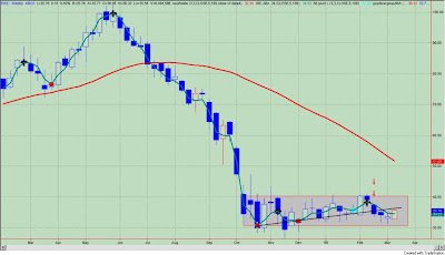
Figure 2 is a weekly chart of the i-Shares MSCI Brazil Index Fund (symbol: EWZ).

Figure 2. EWZ/ weekly


Original comment: The breakdown of 4 weeks ago (red down arrows on chart) is this week's re-test. A weekly close above 36.50 would reverse this breakdown and lead to higher prices. In all likelihood, EWZ remains in the "box" (i.e., range) with the quarter 4, 2008 lows on the downside and early February, 2009 highs on the upside.

Follow up comment: EWZ still remains in the "box". A"break out" from this range should catapult prices to the 40 week moving average.

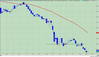
Figure 3 is a weekly chart of the i-Shares Dow Jones REIT Trust Index (symbol: IYR).

Figure 3. IYR/ weekly


Original comment: The breakdown of 4 weeks ago (red down arrows on chart) is this week's re-test. A weekly close greater than 26.78 (resistance) would be constructive.

Follow up comment: Prices are still retesting the break down area; I would use a weekly close over 29.37 (prior key pivot) as a real marker that the trend has changed.

Figure 4 is a weekly chart of the i-Shares MSCI EAFE Index Trust (symbol: EFA).

Figure 4. EFA/ weekly


Original comment: This ETF represents developed countries in Europe, Asia and the Far East. EFA remains in a down trend, and yesterday's bounce appears to be nothing more than noise at this point in time.

Follow up comment: For now, this looks like nothing more than a bounce into resistance.

Key Price Levels: March 24, 2009

Although the price action has been positive, prices have yet to clear prior key pivot points or resistance levels on a weekly closing basis.

Please review the methodology and the significance of the key price levels by clicking on this link.

A weekly cart of the S&P Depository Receipts (symbol: SPY) is shown in figure 1. The frenetic move on Monday was positive in so far as prices are back in the down channel, but the key pivot point (or resistance level) at 82.61 has yet to be taken out on a weekly closing basis. If this level is taken out, then prices will need to contend with resistance levels at 86.78, which is the upper channel line and the next key pivot level to the upside. As stated in this week's sentiment post, you will need to be nimble as I believe the majority of the price move is already behind us.

Figure 1. SPY/ weekly


A weekly chart of the Diamond Trusts (symbol: DIA) is shown in figure 2. The DIA will likely close the week above the November, 2008 lows at 74.50 (horizontal pink line). There is resistance at the lower channel line and prices have yet to close above the prior key pivot point at 82.64. This move in the DIA still "smells" of a bounce into resistance.

Figure 2. DIA/ weekly


Figure 3 is a weekly chart of the Power Shares QQQ Trust (symbol: QQQQ). The QQQQ is our best performer as prices have catapulted outside the upper channel line. A weekly close over the two upper pivots (at 30.33) would be considered a "breakout" in my book. The last "breakout" in early February was a fake out, but if this one "sticks", expect a melt up to $35 at the 40 week moving average.

Figure 3. QQQQ/ weekly


Figure 4 is a weekly chart of the i-Shares Russell 2000 Index (symbol: IWM). This is a similar scenario to the SPY as prices are back in the channel, yet prices have yet to close over the prior key pivot point at 42.48 on a weekly closing basis.

Figure 4. IWM/ weekly

Sunday, March 22, 2009

Investor Sentiment: Not A Factor

This week investor sentiment is neutral. The bearish sentiment (i.e., bull signal) of the past three weeks has dissipated. Going forward, equities will need to rely upon their own merits to score gains. In other words, as bears have turned into bulls, sentiment will be less of a factor in any price appreciation.

The "Dumb Money" indicator is shown in figure 1. The "dumb money" looks for extremes in the data from 4 different groups of investors who historically have been wrong on the market: 1) Investor Intelligence; 2) Market Vane; 3) American Association of Individual Investors; and 4) the put call ratio.

Figure 1. "Dumb Money"/ weekly


As you can see, the "dumb money" indicator has moved out of the extreme bearish zone (i.e., bull signal) and it is now neutral. This is typical as prices move higher. The stock market is recruiting more believers (i.e., bulls). It takes bulls to make a bull market so we need to see more bulls. This is one interpretation for the indicator. Another interpretation is that stocks will need to make price gains on their own merit (i.e., fundamentals) as sentiment is no longer a factor.

Looking forward, two scenarios are possible: 1) the market continues its winning ways in which case the indicator will move higher as more bears are converted to bulls; or 2) the price gains will level out in which case the indicator will remain stuck in the neutral zone. In scenario #1, the market and current intermediate term price cycle will top out when there is extreme bullish sentiment (i.e., bear signal). In scenario #2, the rally will likely churn along for the next four to six weeks before rolling over and retesting the March, 2009 lows. As I believe that the current rally is a counter trend rally within an ongoing bear market, I am expecting the latter scenario. I would be happy if I am wrong.

The S&P500 gained about 20% from the March 6 low to the March 19 high; this was over 9 trading days! On a close to close basis, the move has been 12% or a whopping 300 plus percent annualized. It is my guess that the best part of the move is behind us, and we are likely playing for a retest of the March 19 highs (which is only 4.5% above us) or possibly the key resistance levels between 820 and 830 on the S&P500 (which is approximately 7.5% away). You will need to be nimble to make money.

For completenss sake, I have included the "Smart Money" indicator in figure 2. The "smart money" indicator is a composite of the following data: 1) public to specialist short ratio; 2) specialist short to total short ratio; 3) SP100 option traders.

Figure 2. "Smart Money"/ weekly

Friday, March 20, 2009

Semiconductor Sector: Potential For Secular Run

I like to seek out assets or sectors where the secular winds will propel prices higher. In other words, I am looking for the "next big thing", and the semiconductor sector would qualify. From a technical perspective, this sector has all the right attributes to undergo a prolong run.

Figure 1 shows a monthly chart of the PHLX Semiconductor Sector Index (symbol: $SOX). The indicator in the lower panel is our "next big thing" indicator, and as we can see it is in that zone where a secular trend change is typically launched from. The "next big thing" indicator isn't so much a timing tool, and this can be seen by the vertical gray line when the indicator went into "the zone" back in 2002. This was early and prior to the ultimate bottom. Nonetheless, the indicator tends to identify the potential for a secular trend change. In other words, you have to be able to walk before you can run, and many assets will cycle through this phase. This is rather consistent across assets and time.This is not an indicator for the 10 minutes or 10 weeks. We are looking where I want to be for the next 10 months!

Figure 1. $SOX/ monthly


What does the indicator measure? While proprietary, I will say that the indicator measures as much on the y axis (i.e., price) as it does on the x axis (i.e., time). Most indicators and technicians just look at price; I am also looking at time.

Other technical tidbits are worth noting. See figure 2 a monthly chart. Prices are in the range of the August, 1998 and October, 2002 lows. Past bottoms were made in these areas. The indicator in the lower panel looks at the current price relative to past pivot points over a 36 month time look back period. The down trend (black line) of the indicator has been broken, which I interpret as the down trend in price being broken as well.

Figure 2. $SOX/ monthly


The technical evidence suggests that "the bottom" is in for semiconductors. The potential for a secular trend change is there. If the general market gains traction - a big "if" here as I view the current market rally as a counter trend rally in an ongoing bear market - then it would not surprise me to see the semiconductor sector providing leadership.

Wednesday, March 18, 2009

Key Price Levels: March 19, 2009

Four weeks ago, the breaks of key support levels led to accelerated selling. These old support levels become new resistance, and for the most part that is where we find prices on the major indices--butting up against these resistance levels.

Please review the methodology and the significance of the key price levels by clicking on this link.

A weekly cart of the S&P Depository Receipts (symbol: SPY) is shown in figure 1. 4 weeks ago, SPY broke below the key support level at 81.17 and essentially fell out of the channel (down red arrows). As expected, prices dropped rapidly, and lower prices brought out more bears. With sentiment too bearish, the markets reversed strongly. While prices are above the 2008 lows (horizontal pink line), we have yet to re-enter the channel. In other words, prices are back to their breakdown levels. With the market overbought, I could make a serious argument that this bounce is nothing more than a retracement back into resistance. However, this bearish outlook has to be tempered by the bullish sentiment picture. As of this past week, investors remain bearish and on the sidelines and the "smart money" is bullish. There should be support for buying the dips.

Figure 1. SPY/ weekly


A weekly chart of the Diamond Trusts (symbol: DIA) is shown in figure 2. The DIA have yet to close above the November, 2008 lows at 74.50 (horizontal pink line). This is not channel resistance nor is it key level resistance. This is just the November lows, which are significant.

Figure 2. DIA/ weekly


Figure 3 is a weekly chart of the Power Shares QQQ Trust (symbol: QQQQ). The QQQQ is our "best" performer as it still remains within the trend channel, and prices remain above the 2002 lows. The close below the key support level at 27.63 should have led to accelerated selling, but as we know, sentiment became too bearish. The reversal back above this level is significant, in my opinion, and prices are now back to resistance at 29.72. A weekly close above this level would also be a breakout from the upper channel line.

Figure 3. QQQQ/ weekly


Figure 4 is a weekly chart of the i-Shares Russell 2000 Index (symbol: IWM). This is a similar scenario to the SPY and DIA. There was a break below key support levels (red down arrows on chart) and prices fell out of the channel. The bounce brought prices back above November, 2008 lows (pink horizontal line), but they are now butting up against old support levels.

Figure 4. IWM/ weekly

Tuesday, March 17, 2009

AIG Bailout: The Real Message

In his letter to Treasury to justify bonuses paid to AIG employees, government appointed chairman Edward M. Liddy states:

“We cannot attract and retain the best and the brightest talent to lead and staff the A.I.G. businesses — which are now being operated principally on behalf of American taxpayers — if employees believe their compensation is subject to continued and arbitrary adjustment by the U.S. Treasury.”

How often in the past months have we heard the same rational to justify the status quo on Wall Street?

"The best and the brightest" - hardly? These are the same people who drove their company into the ground, who almost brought the economy to a standstill, and who operated with no moral compass whatsoever.

The real message of "the best and the brightest" is this: We have locked the door. We have thrown the key away. We are not letting you in to our culture of being grossly overpaid for marginal performance. It is Wall Street doing whatever it can to protect its turf.

I seriously doubt that there is anything special about those who work on Wall Street. I am sure they are of normal intellect and abilities just like the rest of us who work on Main Street. And with the carnage in the markets over the past year where few went unscathed, I have no problem making such an assertion. There were few standouts amongst "the best and the brightest".

There once was a time when "the best and the brightest" pursued a calling like medicine or teaching. There once was a time when "the best and the brightest" were not only recognized for their abilities but also for their passion and ideals. Having ideals is not something most Americans would associate with Wall Street, and AIG's move to reward its executives for driving their company into the ground is an insult to all Americans who are "the best and the brightest" everyday. Wall Street and AIG needs to get on board and make the sacrifices -like the American taxpayer- to help resolve the financial crisis and many problems facing our country.

Sunday, March 15, 2009

Investor Sentiment: Still Bullish

Despite last week's big jump in the equity markets, the "dumb money" remains bearish on equities. These investors appear to be reluctant and still on the sidelines. The "smart money" is still bullish. This is a bullish alignment of signals suggesting that dips will be bought.

The "Dumb Money" indicator is shown in figure 1. The "dumb money" looks for extremes in the data from 4 different groups of investors who historically have been wrong on the market: 1) Investor Intelligence; 2) Market Vane; 3) American Association of Individual Investors; and 4) the put call ratio.

Figure 1. "Dumb Money"/ weekly


The "smart money" indicator is a composite of the following data: 1) public to specialist short ratio; 2) specialist short to total short ratio; 3) SP100 option traders. The "Smart Money" indicator is shown in figure 2.

Figure 2. "Smart Money"/ weekly


A 10% "pop" in one week, and the "dumb money" still remains bearish. Maybe they know something? It doesn't seem likely as they (i.e., the "dumb money") were holding on since the January, 2009 highs and hoping that the November, 2008 lows would hold. Woops!! That didn't work out. It appears that the "dumb money" threw in the towel at the wrong time.

In any case, the "Smart Money" and the "Dumb Money" indicators remain bullish, and it is my belief that dips will be bought. After a 10% up move in a week, one would expect the market to pullback, but often times in the markets, there is a gap between our expectations and reality. The pullback will be bought. However, I just don't know how deep or shallow the "expected" pullback will be.

As stated last week, I believe this will be a counter trend rally within an ongoing bear market. This will not be "the bottom", and it is my belief that "the bottom" will take time (i.e., many more months) to develop.

Wednesday, March 11, 2009

Did You Miss The Boat?

Did you miss the boat?

Don't worry I did too? Who could possibly see a one day 6% "pop" coming? The sentiment data suggested it was in there -somewhere!! - but it just doesn't tell you when. Like I stated in the article, "Putting A Bullish Signal In Context", the optimal time to buy is after 2 consecutive weeks of bearish sentiment. So I was on the sidelines too. No biggy.

But my point of this post is not to tell you that I actually follow my strategies, but to tell you that there is a good chance that we could have an opportunity to "buy the dip" as the market is short term overbought. What is that Bob Marley song? "Don't Worry, Everything Is Gonna Be Alright".

See figure 1 a daily chart of the QQQQ. The oscillator in the lower panel is our short term mean, reverting oscillator constructed from sentiment ($VXN, put call) and market breadth (up volume/ total volume, advance decline) data. The indicator is overbought to an extreme degree and while overbought can become more overbought, overbought extremes in the indicator in this bear market have typically signaled either a high in prices (vertical lines) or a period of consolidation (gray boxes).

Figure 1. QQQQ/ daily


Do I wish I was in buying the market on Monday at 3:59 pm? Sure. But it never works that way. The short term oscillator suggests a high likelihood of a pull back over the coming days.

Charts Of Interest

Figure 1 is a weekly chart of the PowerShares QQQ Trust (symbol: QQQQ). This is our proxy for the NASDAQ 100. "Tech" continues to be our relative out performer. Last week, the QQQQ's broke below the key support level at 27.63 and fell out of the channel, and my expectation was for an acceleration of prices lower. 27.63 becomes resistance.

Figure 1. QQQQ/ weekly


But then there was this sentiment thing that got in the way. No problem. Yesterday's reversal is constructive, but a weekly close above 27.63 would provide confirmation of higher prices.

Figure 2 is a weekly chart of the i-Shares MSCI Emerging Market Index (symbol: EEM). EEM is one of the few ETF's forming a nice base. First off, EEM did not violate the quarter 4, 2008 lows at 20.45. This is our support level, and any weekly close below 20.45 would be an ominous sign. The initial upside is 25.50.

Figure 2. EEM/ weekly


Figure 3 is a weekly chart of the i-Shares MSCI Brazil Index Fund. The breakdown of 4 weeks ago (red down arrows on chart) is this week's re-test. A weekly close above 36.50 would reverse this breakdown and lead to higher prices. In all likelihood, EWZ remains in the "box" (i.e., range) with the quarter 4, 2008 lows on the downside and early February, 2009 highs on the upside.

Figure 3. EWZ/ weekly


Figure 4 is a weekly chart of the i-Shares Dow Jones REIT Trust Index (symbol: IYR). The breakdown of 4 weeks ago (red down arrows on chart) is this week's re-test. A weekly close greater than 26.78 (resistance) would be constructive.

Figure 4. IYR/ weekly

Figure 5 is a weekly chart of the i-Shares MSCI EAFE Index Trust (symbol: EFA). This ETF represents developed countries in Europe, Asia and the Far East. EFA remains in a down trend, and yesterday's bounce appears to be nothing more than noise at this point in time.

Figure 5. EFA/ weekly

Sunday, March 8, 2009

Putting A Bullish Signal In Context

Figure 1 shows the "Dumb Money" indicator. The "dumb money" looks for extremes in the data from 4 different groups of investors who historically have been wrong on the market: 1) Investor Intelligence; 2) Market Vane; 3) American Association of Individual Investors; and 4) the put call ratio. The indicator has moved to an extreme reading suggesting that retail investors are bearish on the equity markets, and this is a bullish signal.

Figure 1. "Dumb Money"


So what does a bullish signal mean for equity prices? To assess the significance of a bullish signal, I will construct a strategy to buy and hold the S&P500 only during those times when investor sentiment, as measured by the "dumb money" indicator, is bearish (i.e., bull signal). So we "buy" the S&P500 when the "dumb money" indicator turns bearish (i.e., bull signal) and sell the position when the indicator moves to neutral. All signals are based upon weekly closing prices, and slippage and commissions are not considered in the results.

Since August, 1990, there have been 41 unique signals (or trades) when the "dumb money" went bearish. 81% of the trades were winners, and the average trade lasted 6.1 weeks. Such a strategy generated 549 S&P500 points; over the same time period, a buy and hold strategy yielded 348 S&P500 points. With the strategy, your total time in the market would have been 21%. What is noteworthy about this strategy is that for only 1/5th market exposure you beat a buy and hold strategy by a little more than 1.5 times (549 S&P500 points/ 348 S&P500 points). So when this strategy is active and in the market, you are earning a return at a 35% annualized rate. I would call that an accelerated gain.

Applying the same strategy to the NASDAQ 100, yields the following results: 1) there were 41 trades; 2) 78% were profitable; 3) this yielded 1883 NASDAQ 100 points; 4) over the same time period, buy and hold yielded 858 NASDAQ 100 points; 5) with the strategy, your time in the market was 21%. With the strategy and for only 1/5th market exposure, you beat buy and hold by over 2 times. Or when the strategy is active and in the market, you will see your money grow at an 80% annualized rate. Now that is definitely accelerated.

So this is just one of the reasons why I believe that a contrarian approach is worthwhile to pursue. Now remember, we are not crafting a real strategy here; we are only looking at this period when investors (i.e., the "dumb money") are bearish.

But as we all know, there is no free lunch when it comes to the markets, and any discussion of a strategy would not be complete without some mention of the risks involved. This is my way of saying that betting against the consensus is no "holy grail" strategy.

To assess risk and to put a bullish signal into some context, we will look at the MAE graph for the above strategy involving the S&P500. MAE stands for maximum adverse excursion, and each caret in the graph is representative of 1 trade from the strategy. MAE measures in percentage terms how much each trade moves adverse to or against its entry price before it is closed out for a profit or loss.

So let's refer to figure 2 and the individual trade inside the blue box. This trade was put on and lost 7% (x axis) before being closed out for an 8.5% profit (y axis). We know that it is a profitable trade because the caret is green. Now focus to the right of the blue vertical line. There were 6 trades (out of 41) that had excessive MAE's that resulted in significant losses. There is real risk even when betting against the consensus. Of note, the signal labeled #1 was from May to August, 2002; the signal labeled #2 was September to November, 2008.

Figure 2. MAE Graph/ SP500


The MAE graph for the NASDAQ 100 trade is shown in figure 3. Of the 41 trades, 9 had MAE's in excess of 10%; this is to the right of the blue line.

Figure 3. MAE Graph/ NASDAQ 100


So let's summarize to this point. Betting against the consensus can yield significant gains with minimal market exposure. As the MAE graphs show, risks still remain.

Now the question becomes: how do we continue to maximize our gains while minimizing our risks? To look at this question, we will construct another strategy where we buy the S&P500 after two consecutive weeks of the "dumb money" being bearish; we will sell our position, as before, when the "dumb money" indicator turns neutral. With this strategy, there are 37 trades. 78% are profitable yielding 626 S&P500 points. Our time in the market is now reduced to 17%. So just by waiting a week to "buy", we increase our points gained (by ~15%) and decrease our time in the market.

Furthermore, the MAE graph (see figure 4, below) now clearly shows that any trade that had a draw down greater than 6% from its entry price ended up being a loser or closed out for a small gain. These are the trades to the right of the blue line. This suggests to me that any trade in the S&P500 that incurs a loss greater than 6% will likely not recover and lead to further losses. In other words, this is a failed signal.

Figure 4. MAE Graph/ SP500

Applying the same strategy to the NASDAQ 100, yields the following results: 1) there were 37 trades; 2) 73% were profitable; 3) the strategy now yields 2206 NASDAQ 100 points; 4) your market exposure is reduced to 17%. More points with less exposure equates to more efficient market timing. The MAE graph is shown in figure 5.

Figure 5. MAE Graph/ NASDAQ 100


So what does it all mean?
1) To beat the market, you cannot be the market. Therefore, bet against the consensus.

2) Like all strategies, there are failures.

3) When the "dumb money" indicator turns bearish, the optimal -not the best - time to act is after two weeks. Gains can be improved and risks reduced (but not eliminated). Using stop losses, hedging strategies, or entries based upon other technical markers (i.e, a close greater than the previous week's high) may improve the efficiency of this strategy.

4) I hope I have demonstrated the importance of paying attention to extreme investor sentiment.

Investor Sentiment: Bullish Signals

For 13 weeks the "dumb money" has been on the wrong side of the trend and hopeful that the November, 2008 lows would hold. The "smart money" has not been bullish on the markets for about 20 weeks now. With the November, 2008 lows on the S&P500 convincingly behind us, the "dumb money" has turned bearish and the "smart money" is now the most bullish it has been in 30 weeks. These are bullish signals for equities.

The "Dumb Money" indicator is shown in figure 1. The "dumb money" looks for extremes in the data from 4 different groups of investors who historically have been wrong on the market: 1) Investor Intelligence; 2) Market Vane; 3) American Association of Individual Investors; and 4) the put call ratio.

Figure 1. The "Dumb Money"


The "smart money" indicator is a composite of the following data: 1) public to specialist short ratio; 2) specialist short to total short ratio; 3) SP100 option traders. The "Smart Money" indicator is shown in figure 2.

Figure 2. The "Smart Money"


Since the inception of this blog in November, 2008, I feel that the sentiment picture has helped us successfully navigate this market. For the most part, I have been bearish on equities or suggesting that strength be sold. For the last 16 weeks, the sentiment data has not been supportive of a tradeable, sustainable rally.
So here we are with the "smart money" bullish and the "dumb money" bearish. Beautiful! According to the back testing process, the optimal time to buy would be after this Friday's close.

In a follow up article (hopefully this week), I will put some context to these signals. They are by no means perfect or trading "holy grails". But we should pay attention to market sentiment as the current set of conditions can lead to accelerated gains as those on the sidelines chase prices higher.

Lastly, if equities do rally, I believe this will be a counter trend rally within an ongoing bear market. This will not be "the bottom", and it is my belief that "the bottom" will take time (i.e., many more months) to develop.

Friday, March 6, 2009

Macro Thoughts By Guest Contributor

The following is a link to a PDF written by good friend, Tyler Lang. Tyler is an analyst for Tapke Asset Management, LLC. Tyler's macro thoughts were written about two months ago, and his ideas are a nice tie in to the concerns I expressed in the article, "It's A New Era Of Thrift." For example, Tyler's first concern for the US economy is that "consumer credit has peaked and we are beginning a secular shift toward frugality and risk aversion".

It's a quick read. Thanks Tyler.

To access the PDF, please follow this link: Macro Themes

Thursday, March 5, 2009

Jim Cramer Puts Foot In Mouth Again!

Jim Cramer is at it again -speaking before thinking and pontificating on a subject he knows very little about.

Before we get to another Jim Cramer "moment" let me state that I have no personal axe to grind with him, and in fact, as a former contributor to TheStreet.com, I am indebted to Jim Cramer for giving me a start and some credibility in the financial publishing business. I don't know the man, and I doubt he is even aware of my existence. I think he is genuine about helping investors, but I guess his downfall is that he must be a entertainer first and an analyst second. It is a tough job.

Where I take umbrage with Mr. Cramer is in the following CNBC "Mad Money" segment shown on March 3, 2009. Cramer calls technical analysis "hocus pocus", "voo doo" and "mumbo jumbo".


Gee, now I know why I don't get it right all the time. I was practicing "voo doo". I should have paid more attention to fundamentals. Not!


While I am not here to defend the art/ science of technical analysis, I believe folks have difficulty with TA because they expect it to be a science, but they really practice it like an art because they haven't done the homework to find what works and what doesn't. In my opinion, using tools and indicators that work fair at best will yield fair results. Using tools that you have no idea how they work is definitely a recipe for disaster. I suspect a lot of people use TA in this fashion.

The study of price movements (i.e., technical analysis) is the purest form of fundamental research. After all, everything that is known about an equity or an asset should be reflected in the price. Technical analysis also lends itself to rigorous analysis. One can easily quantify -if they do the homework - the significance of certain price movements. This doesn't mean that TA is always right, but it can easily improve the odds for success.

Wednesday, March 4, 2009

It's A New Era Of Thrift

The troubles in the financial markets over the last year will lead to a new era of thrift, and this will be radically different than the past 20 years of excesses as consumers change their habits. Consumers are already retrenching and increasing their savings amongst the economic uncertainty, but I think these changes portend an even deeper shift in personal behavior.

This is a story of three successful "40 somethings" who are cutting back not because they have to but because they want to. They have given up on the markets -not because of losses - but because it has failed them. These people are cutting back because they sense a long period of economic malaise that won't be fixed by increased spending or a new bailout program. And they believe that the economic malaise and dislocations will result in opportunities far off in the future, and they want to be in position, with cash on hand, to take advantage.

Tom is a mergers and acquisitions lawyer who made over $300,000 in 2007. He started his own firm in 2008, but looking ahead, he projects that his billings will be down, and he expects to be making about two thirds of what he used to make. Furthermore, being the only boss is losing its appeal. Tom is looking to downsize. He is going to merge his firm with another, and he is moving from a bigger house to a smaller one. Even though he lost over 50% of his net worth last year, he knows that he could ride out the storm, but what is the point. Tom can live a lot simpler without all the stress, and he never wants to put himself in that position again where his financial well being is dependent upon others. Tom is pulling back on his spending and his investments not because he has to but because he wants to.

Pete is a children's dentist with significant and stable investments in rental properties. He really hasn't taken a hit on his income from the practice or his investments. Pete is cutting back because he has too much on the table; his balance sheet is leveraged more than he would like especially when he considers the prospects for the economy. Pete doesn't have to downsize but he wants to because he wants to improve his cash flow.

Steve is a successful physician with a stable salary. In fact, Steve's wife also is a physician, so they have two very stable salaries. Yes, they lost in last year's market, but with 15 years of productive work life ahead of them, they are not too concerned. While retirement is far off, Steve and his wife see the current economic dislocations as an opportunity to plan for the future. They would like to buy a retirement home with a view of the ocean. Prior to 2008, this was just a silly notion, but maybe, just maybe, they now think it is possible. Of course, this will require savings, which means they will be cutting back too.

So there you have it. Tom is downsizing to simplify his life. Pete is cutting back to improve his balance sheet. Steve is saving more because he recognizes that the current dislocations in the economy will create opportunities. These folks don't have to cut back but they want to, and this dynamic isn't recognized by the pundits on Wall Street. If you listen to CNBC, you get the sense that all our ills will be solved by one more bailout or if not one more, than the right bail out. I got news for you: that game is over. It doesn't matter anyway, I believe the dynamic has shifted in this country from spenders to savers.

Furthermore, the financial pundits seem to imply that savings is only for those on the bubble - those who have lost a job or might lose one as they are downsized by their company. But what I see and hear is that financial prudence is for those who have the means as well and have been somewhat immune to the recession. There is no question that people are cutting back, and it just isn' t people who are on the bubble or who live their life in fear. People with means are pulling in their horns too.

The financial markets have failed investors. There has been a tremendous transfer of wealth from Main Street to Wall Street. Investors have made "bubkus" in this decade, yet CEO's and insiders have made millions for driving their companies into the ground. Wall Street has done little for shareholders. Tom, Pete, and Steve recognize that if they had acted so irresponsibly in their professional lives they would have lost their right to practice medicine or law. They are disgusted with the markets and bailouts to help those who acted recklessly and irresponsibly. They have turned a deaf ear to the financial pundits who clamour on about the need for just one more bailout to fix everything. Tom, Pete and Steve are taking matters into their own hands. Wall Street matters little as the wheels for a new era of thrift have been set in motion.

Tuesday, March 3, 2009

Key Price Levels: March 4, 2009

Support.....what support? There are no nearby support levels when it comes to the S&P Depository Receipts (symbol: SPY) or the Diamond Trusts (symbol: DIA). Even the October, 2002 levels are in the rear view mirror.

Please review the methodology and the significance of the key price levels by clicking on this link.

A weekly cart of the SPY is shown in figure 1. The breaks below these key support levels has led to accelerated selling such that the October, 2002 low (horizontal pink line) at 77.07 was easily taken out. The increased selling pressure is most likely accentuated by the lack of nearby support levels. Prior support at 77.07 now becomes resistance, and note how this area of resistance coincides with the lower part of the trend channel where the SPY broke down. If stocks were to gain some traction - a big IF indeed- I would expect the SPY to retrace to this breakdown area before selling ensued again. From current levels this would be about a 10% pop.

Figure 1. SPY/ weekly


A weekly chart of the DIA is shown in figure 2. Like the SPY, the Dow continues it move lower with no chart support in sight. The pink horizontal line represents the October, 2002 low at 71.81. If a sustainable bounce were to develop, 78.50 is the main resistance level. This is a little more than 15% away from the current price.

Figure 2. DIA/ weekly


Figure 3 is a weekly chart of the Power Shares QQQ Trust (symbol: QQQQ). The QQQQ is our "best" performer as it still remains within the trend channel, and prices remain above the 2002 lows. However, if prices close the week below 26.98 (and in particular 27.63), I would be very cautious as we could see accelerated selling in the QQQQ.

Figure 3. QQQQ/ weekly


Figure 4 is a weekly chart of the i-Shares Russell 2000 Index (symbol: IWM). Last week, IWM closed outside the trend channel and below any visible means of support between 40.73 and 42.48. This is new resistance. Like the SPY and DIA, IWM should see accelerated selling and should be visiting its October, 2002 lows at 32.30.

Figure 4. IWM/ weekly

Anything Is Possible

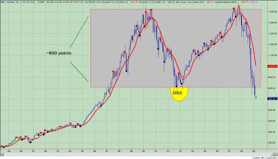
I happened to be looking at a monthly chart of the S&P500 the other night to get some perspective. See figure 1, a monthly chart of the S&P500.

Figure 1. S&P500/ monthly


My first thought was "oh my god" as the S&P500 closed below the September, 2002 low pivot. (See the yellow half oval in figure 1.) Could it be - a mega "M" type top? Using classical technical analysis, a break down of such a magnitude implies a price projection of 200 on the S&P500. Yikes!

Here is the math. The width of the base is approximately 600 S&P500 points. You take the break down point (~ 800 on the S&P500) minus the width of the base, and this yields a price projection of 200.

Seems improbable. But of course anything is possible.

Then I came across this video of Louise Yamada of Louise Yamada Technical Research Advisors who discusses the significance of this technical break, and she even suggests (forecasts?) that the S&P500 could reach 400. Wowser!


But what is interesting about Yamada's comments is not the technical "call" but the fact that she speaks about a "wealth destruction phase" that would be very similar to the early 1930's. My point here isn't to be an alarmist, but such projections really are scary. If they come to fruition, they will likely have important implications for all of us.