.png)

 Posts
Posts





.png)
.png)
This is a very nice explanation of GDP and what goes into its calculation from the Consumer Metrics Institute. I thought it was worth the read.
Showing posts with label Economic. Show all posts
Showing posts with label Economic. Show all posts
Sunday, January 30, 2011


Saturday, July 24, 2010
Taking A Stance
This is the bullish argument as put together by good friend TL. It is an excellent review of the bullish and bearish arguments facing investors today. Our analyst comes down on the side of the bulls as he finds monetary policy, valuations, and sentiment favorable. Thanks TL!

Wednesday, April 28, 2010
Great Insight Into The Consumer And Retail Sector
I had the privilege yesterday of receiving an email from Richard Davis of the Consumer Metrics Institute, Inc. Mr. Davis had read my blog post on the SPDR S&P Retail ETF (symbol: XRT), and he has graciously allowed me to post his email below with some very interesting data and insights with regards to the consumer.
Thursday, March 25, 2010
Higher Yields, Lower Equities?
For the longest while, my mind set has been to expect higher yields accompanied by higher equity prices. After all, wouldn't higher yields be a sign that the economy is expanding and on the track to recovery? Or to put the relationship between bonds and equity prices in another light: if the equity markets would ever sell off, wouldn't bonds catch a bid as there is a flight to safety? But the technicals have me rethinking these relationships. Is it possible that we could have higher yields and lower equities?
Friday, March 12, 2010
Employment Report: Leading Indicators
This is a top shelf, 9 page report on employment as prepared TL. He presents 8 leading indicators of employment and comes to the conclusion: "On the whole, these leading indicators paint a positive picture, indicating that net hiring should emerge before the end of the second quarter."
Wednesday, February 10, 2010
Ceridian - UCLA Pulse of Commerce Index
The Ceridian - UCLA Pulse of Commerce Index tracks fuel purchases at 7000 truck stops around the country, and the idea is that the index will mirror industrial production providing a timelier snapshot into the state of the economy. The index was developed by the UCLA Anderson Center in conjunction with credit card processor Ceridian.
Wednesday, February 3, 2010
Copper: Market Top?
Copper, the metal with the Ph. D. in economics, has retreated some 12% over the last 4 weeks. Possible causes include: 1) slowing economic growth; 2) withdrawal of stimulus money worldwide especially in China; 3) supply demand imbalances; and 4) bubble dynamics that has seen excessive speculation in the metal.
Tuesday, October 27, 2009
Treasury Yields: Observations
The only asset moving up over the last week has been longer term Treasury yields. This is odd especially in the face of equity market weakness and especially since demand for Treasury bonds has outstripped supply over the past year. So why are yields moving up now? Maybe yields are rising in anticipation of buyer fatigue as this week's record bond issuance comes to market.


This is difficult to know until it happens, but I can say for sure that yields are not rising because of inflation concerns nor are they rising because of strength in the economy. Yields generally rise after an economic expansion is well under way and they generally rise when the unemployment rate falls. The last time I checked, the unemployment rate was still rising; the economy had stopped its free fall, but visibility was less clear; and deflation seem to be a bigger threat than inflation.
Over the past several months, lower Treasury yields did not confirm the strength in the stock market, and this has been a glaring divergence that I have noted on more than one occasion. Now with weakness in the equity markets imminent (but not guaranteed), yields start to move higher. Hmm. I hope this isn't the new normal?
Technically, long term Treasury yields have the characteristics of an asset that could undergo a secular change in trend. This has been a theme that I have been on for over 10 months now, but in all honesty, yields have yet to show real sustainable strength. The best that I can say about my analysis is that I have said to avoid Treasury bonds for anything but a trade.
See figure 1, a weekly chart of the yield on the 10 year Treasury bond. The 10 year Treasury did trade to a yield of 4% back in June, but they fell back to 3.1% level before bouncing. Yields are above the prior weekly pivot high point at 3.437% and the down sloping black trend line, and it would be bullish for higher yields if there was a monthly close over the prior low pivot (on a monthly chart) at 3.432%. Yields appear likely to trade to the resistance zone between 3.856 to 4%.
Figure 1. $TNX.X/ weekly

Why yields should move higher has been a subject of much conjecture all year long. Nonetheless, increasing bond supply has been met by buyer demand, and the fundamental back drop (despite the stock market rally) really has not been conducive for higher yields. The technicals are at odds with the fundamentals.
Other observations are noteworthy. Figure 2 is a daily chart of the ProShares UltraShort Lehman 7-10 Year Treasury (symbol: PST), which seeks results that are twice the inverse of the daily performance of the Barclays Capital 7-10 Year U.S. Treasury index. The triple bottom is is quite noteworthy.
Figure 2. PST/ daily

Figure 3 is a daily chart of the ProShares UltraShort Lehman 20+ Year Treasury (symbol: TBT), which corresponds to twice the inverse of the daily performance of the Barclays Capital 20+ Year U.S. Treasury index. The double bottom is quite noteworthy, as indicated by the volume spike.
Figure 3. TBT/ daily

Another observation comes from the Treasury Inflation Protected Securities or TIPS market. As recently as last week, I was under the belief that yields were heading lower. Why? TIPS were headed higher. There is a very clear inverse relationship between TIPS and 10 year Treasury yields. This can be seen in figure 4. As TIPS go up; long term yields go down.
Figure 4. TIPS v. $TNX.X/ weekly

However, TIPS have not followed through (and I could be wrong!), but they haven't broken down completely yet. A monthly close below the pivot at 102.75 would be reason enough to abandon the notion of higher TIPS. See figure 5. A monthly close below this level would add credence to the notion of higher Treasury yields.
Figure 5. TIPS/ monthly

So let's summarize. There are lots of conflicting crosscurrents when it comes to yields on longer term Treasury bonds. Whether the current mini-lift in yields develops into a longer term sustainable trend is not certain as the fundamentals are at odds with the technicals. Nonetheless, betting on higher yields - because of the technical, secular tailwinds - may be the easier trade to make at this juncture.
Tuesday, October 20, 2009
If TIPS Are Going Higher, Then...
If Treasury Inflation Protected Securities (TIPS) are going higher, then yields on the 10 year Treasury bond are going lower.

See figure1 a weekly chart comparing the yield on the 10 year Treasury bond (symbol: $TNX.X) in the top panel to the i-Shares Lehman TIPS Bond Fund (symbol: TIP) in the lower panel. There is a clear inverse relationship between these two assets. Troughs in $TNX.X coincide with peaks in TIP. Peaks in $TNX.X coincide with troughs in TIP.
Figure 1. $TNX.X v. TIP/ weekly

I believe TIP is going higher, and I have presented my rationale in these three articles:
So if TIP is going higher, then yields on the 10 year Treasury must be headed lower.
And if yields on the 10 year Treasury are going lower, then equities have a good chance of unraveling. Treasury yields continue to diverge from the equity markets or to put it another way, the Treasury market is not discounting the economic recovery like the equity markets. See "Long Term Treasury Yields: Someone Is Going To Be Wrong". If the economy is recovering, then yields should be headed higher, but they are not. Equity bulls - those bull market geniuses - should be on high alert.
Thursday, October 1, 2009
A Short Term Bottom?
I am not sure what all the excitement is about. Maybe it is the fact that so many investors were positioned a little too bullishly, and with the S&P Depository Receipts (symbol: SPY) down 2.45% for the day on above average volume, it is too much for them to bear - no pun intended! After 6 months of almost no pain for the bulls, I guess a little scratch must feel a like mortal wound.


But the facts are this: since the bull run began in March, 2009 there have been a total of 7 days where the SPY closed 2.45% or lower than the previous day's close. These 7 days are shown in figure 1 (with gray vertical bars), a daily chart of the SPY. A one day rate of change indicator is shown in the lower panel.
Figure 1. SPY/ daily

Each one day sell off was a buying opportunity, so I am not so sure what all the angst is about. Yes, everyone is all in, and one wonders who is left to buy, but the fact is this has been a good buying opportunity the previous 7 times. Can we roll for number 8?
Now all this is written ahead of Friday's employment report, and the market could be up 1.5% pre -open or down the same depending upon "the number". I won't even conjecture what a good number will be; usually what is bad for Main Street (i.e, loss of jobs) is good for Wall Street (i.e, Fed easing). But the Fed can't ease anymore, and after a 50% plus move in the markets, maybe we need to see some real numbers put up on the scoreboard. So a bad number (i.e., loss of jobs) could be bad. Who knows?
In any case, a down open makes the buy more compelling (in my opinion); a big up open less so.
One other factor worth noting. Thursday's price bar on the SPY was a wide range price bar. This means the value from high to low was big, and this difference (between high and low) was statistically significant. Proprietary research shows the following: when such wide range bars occur above the 200 day moving average, higher prices are seen about 80% of the time over the next 5 to 7 trading days.
This is a short term trade set up that you may consider depending upon tomorrow's open. Pick a stop loss point. Control your risk. Set a sell point - like at the 20 day simple moving average or 3% above your entry price. Don't get greedy. This is nothing more than a short term trade.
Two other considerations. One, based upon the McClellan Oscillator of advances and declines, the market is oversold. Figure 2 shows the oscillator below a daily chart of the SPY. Oversold areas are identified with ovals.
Figure 2. SPY/ McClellan Oscillator

Two, the yield on the 10 year Treasury bond (symbol: $TNX.X) has been falling, and I believe that it was good insight on my part to identify the divergence that has been occurring in Treasury yields and in the stock market. See "Long Term Treasury Yields: Someone Is Going To Be Wrong" which was written on August 26. Three points were highlighted in the article:
1) I identified an intermediate term top in Treasury yields.
2) I noted the divergence between yields on the 10 year Treasury bond and equities. Why were yields heading lower (which is a sign of economic weakness) and equities heading higher (which is a sign of economic strength)?
3) I linked the rollover in Treasury yields in 2002 to the rollover of equities that lead to a 25% plunge in the S&P500, and I suggested the possibility that the current weakness in Treasury yields could lead to the same result for equities.
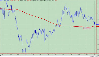
Enough patting myself on the back already as the point can be seen in figure 3, a daily chart of the yield on the 10 year Treasury bond (symbol: $TNX.X). Yields are approaching the 200 day moving average. I still believe we will see lower yields over time - not in a secular, long term way but over the next couple of months - but, it would not surprise me to see yields on the 10 year Treasury bounce at this "key" level for at least a few days. Like 2002, yields appear to be leading stocks lower as economic reality starts to set in. A bounce at the 200 day moving average may be enough to bring in the equity buyers.
Figure 3. $TNX.X/ daily

Now just hope - I hate that word - for a down open!
Friday, September 18, 2009
Cramer: Calling For A Top In Bonds
Jim Cramer is at it again. This time he is calling for a top in US Treasury Bonds. Mama mia, I am heading for the hills. Cramer is calling for higher interest rates, therefore it must be so.
In this video clip taken from "Mad Money", Cramer gives his reasons, and essentially, his premise is built around an economic recovery, higher growth, and inflation. He does acknowledge the roll that the Treasury and Fed may play as they continue to issue supply and expand the debt. There is no mention of the feedback that higher interest rates may have on an economic recovery or inflation.
As usual Cramer is almost certain in his convictions, but I have to tell you, I feel there is very little rigor to the analysis. He states all the usual suspects as to why we should see higher rates, but truth be told and as we have been writing about for the last 6 weeks, interest rates are heading lower while the stock market, which we are told is forecasting a better economy, is heading higher. This is a very noticeable divergence.
I would agree with Cramer that we are on the cusp of a secular trend change that should lead to increasing yield pressures, but I don't see that happening in the near term.
Lastly, in light of my recent look at investor sentiment in the bond market, I guess I should be cheering. Now everyone knows that Treasury bonds are topping (i.e., yields bottoming) because Cramer said so. Cramer calling for a top or a bottom is a frequent occurrence. I suspect if you make enough of them than you will get a few right.
Tuesday, September 15, 2009
Bond Sentiment: Circumstances Are Different
If you have been paying attention the last couple of weeks, I have been warming up to bonds. However, earlier in the year, I thought that Treasury yields would head higher (i.e., bonds lower), and that this would result in a secular trend change. In other words, we would be embarking on a long period of increasing yield pressures. This did not come to pass although yields on the 10 year Treasury bond did reach 4.0%. Despite this failed signal, Treasury yields still have the technical characteristics of an asset poised to undergo a secular trend change, and by secular, I mean lasting years. But not now.


For now, I think a better bet is on higher Treasury bond prices. At least over the next couple of months. In previous articles I have addressed some of the technical reasons why we might see higher prices with Treasury Inflation Protected Securities and why we should see lower yields.
From a sentiment perspective, I have two sources that appear to be at odds with each other. The first comes from Mark Hulbert at MarketWatch. His most recent article is entitled, "Bond Bullishness: Bond timers more exuberant than any time since March, 2001". According to Hulbert, his Hulbert Bond Newsletter Sentiment Index (HBNSI) stood at 62.2%, and "the last time it was higher was March 28, 2001, when the HBNSI stood at 62.7%. Far from rising thereafter, bonds plunged and interest rates rose. Over the subsequent two months, in fact, the CBOE's 10-Year Treasury Yield Index rose from 4.97% to 5.55% -- a big jump in so short a period of time for the normally-staid government bond market."
While Hulbert's statement is true and reason for concern (if you are betting on higher bond prices), the reality is that the bump in yields that he speaks of really was just a counter trend rally within a longer term down trend for the 10 year Treasury yield. In other words, this was just a pullback on the road to higher bond prices. (However, I would not want to have been a buyer of bonds on March 30, 2001). See figure 1 (top price chart), a weekly graph of the yield on the 10 year Treasury bond. March 28, 2001 (i.e., the last major high in the HBNSI) is marked with the red vertical line.
Figure 1. $TNX.X v. S&P500/ weekly

There is another important point worth mentioning: the S&P500 had been in a down trend for the preceding 6 months, and at the end of March, 2001 stocks bounced and so did yields. This can be seen in figure 1 with the S&P500 in the lower panel. So back in March, 2001 (when bond sentiment was so bullish), bonds had been outperforming equities for over 6 months. In addition, investors were very bearish on equities and this would be considered a bullish signal for equities. So it would make sense that investors would sell bonds and move into equities. And that is what they did for 8 weeks, and then the down trend in yields (higher Treasury bonds) and equities resumed.
Now let's fast forward to September, 2009. Bonds have been under performing relative to stocks, which have been going up and up for 6 straight months. Investor sentiment towards equities is extremely bullish. So our investing environment is quite different now, and despite the bullish bond sentiment, the investing environment is 180 degrees opposite that of March, 2001.
Just to confuse the situation even more let me show you another sentiment index. This one comes from the Market Vane Corporation. Market Vane publishes the Bullish Consensus, which is the degree of bullish sentiment for a particular market. From the Market Vane website: "The Bullish Consensus is compiled daily by tracking the buy and sell recommendations of leading market advisers and commodity trading advisers relative to a particular market. The advice is collected by: 1. Reading a current copy of the market advisers' market letter. 2. Calling hotlines provided by advisers. 3. Contacting major brokerage houses to learn what the house analyst is recommending for the different markets. 4. Reading fax and E-mail sent from advisers. The buy and sell recommendations from each adviser are tracked during the day to verify the entry and exit of each trading position. The Bullish Consensus is compiled at the end of the day to reflect the open positions of the advisers as of that day's market close."
How does one interpret the sentiment values from Market Vane? A Bullish Consensus of 65% for an asset implies that 65% of the traders are bullish and expect the price of that asset to rise. Conversely, 35% of the traders are bearish and expect prices to decline.
Figure 2 is a weekly chart of the yield on the 10 year Treasury with the Market Vane Bullish Consensus for Treasury Bonds in the lower panel. The recent low value for the Bullish Consensus occurred in early June, 2009, and it was at 41%. This means that 41% of bond investors were bullish on bonds and 59% were bearish. Since mid-2000, when the Bullish Consensus went below 43% (i.e., 57% bears), yields were likely to top out (as in figure 2) or bonds went higher. These times are noted by the red vertical bars.
Figure 2. $TNX.X v. Market Vane Bullish Consensus Treasury Bonds/ weekly

Not all signals are accurate as seen by the failed signal in 2000 (which is the red vertical bar with the gray oval on it). But this data provides a different picture than the HBNSI. Currently only 51% of the Market Vane respondents are bullish on bonds. Typically, peaks in bonds (or troughs in yields) occur when the value gets above 70%.
Oddly enough, the Market Vane Bullish Consensus was at 55% bulls back in March, 2001. Six weeks prior the value peaked in the 80's suggesting that a bounce in yields was in the offering. (This time period is noted by the gray vertical bar in figure 2.) The current value, while at 51% bulls, is coming from a modest low of 41%.
In sum, bond investors may be bullish like March, 2001, but circumstances are clearly different.
Santelli Rant: Reminiscent Of Peter Schiff
Yesterday, Rick Santelli was on another rant as CNBC was doing its one year anniversary of the collapse of Lehman Brothers and how the bold actions of central bankers saved the world from economic collapse.
It isn't so much what Santelli says that is important -because we have heard it all before - but how dismissive the CNBC anchors were of his comments. Joe, Carl, and Steve have a good time and laugh it up, and in the end, they send the only guy with something to say back to the corner of the classroom to lick his wounds.
In some ways I am reminded of the interviews that Peter Schiff did in 2006 and 2007 prior to the housing bust and recession. Schiff use to come on these shows to present his side of the story. Everyone would gang up on him essentially calling him a nut case. Oh, how wrong they were.
Sunday, September 13, 2009
David Rosenberg: This Is Your Last Chance
Over the last several months, we have been very fortunate to read the missives of Gluskin Sheff's chief economist and strategist, David Rosenberg. Aside from a stellar career at Merrill Lynch, Mr. Rosenberg gained notoriety for his early "call" on the recession that began in December, 2007. Now Mr. Rosenberg is gaining notoriety as the last bear standing. Despite a 50% run in the S&P500 and a growing chorus that the economy has turned a corner, Mr. Rosenberg has been steadfast in his resolve:


"This rally is based on a lot of hope that we are going to see a V-shaped economic recovery in the U.S. The S&P 500 is priced for 4% real GDP growth. We don’t see it."
I am empathetic towards Mr. Rosenberg as I too have had a cautionary view towards equities since mid-May. Being cautious while the market goes up day after day and not seeing what everyone else is seeing (sic) is very frustrating. But leave it to Mr. Market. One minute you are a hero for calling the recession, the next minute you are a goat for missing the recovery. The market beast can be very humbling.
But truth be told, Mr. Rosenberg could be right in the end, and I believe we are now approaching that juncture in the markets that could prove him right. In essence, this is his last chance.
In particular, there is a growing divergence between the 10 year Treasury yield, which is falling, and the equity markets, which are rising.
In "Long Term Treasury Yields: Someone Is Going To Be Wrong", which I wrote on August 26, 2009, I stated:
"the divergence between lower yields - a sign of economic weakness - and higher equity prices - a sign of economic strength - will not persist for long. Most importantly, it was the failed signal in June, 2002 that coincided with a 25% plus drop in equities over the next two months. It should be noted that the current set up in Treasury yields and likely failure is exactly the same as in 2002!"
So why is this Mr. Rosenberg's last chance? Treasury yields are falling (and likely to go lower) and during equity bull markets that is a good thing. But if we are still in a bear market, then falling Treasury yields is a bad sign for equities. And this is the first time since the March, 2009 bottom that Treasury yields are falling. So Mr. Rosenberg still has a chance of being proven right.
Let me demonstrate graphically. See figure 1 and figure 2, weekly charts comparing the S&P500 (symbol: $INX) to the yield on the 10 year Treasury (symbol: $TNX). (Treasury yield data is hidden.) When the 14 week rate of change (i.e., a simple default value) of the 10 year Treasury yield is below zero (as it is now), the price bars appear red. Blue price bars (on the S&P500 price graph) are when the 14 week rate of change on the 10 year Treasury yield is positive.
Figure 1. S&P500 v. 10 Year Treasury Yield/ weekly

As you can see, there is a lot of red from 2000 to 2003 and from 2007 to the recent bottom in 2009. During these bear markets, lower yields translated into equity weakness. Currently, the 14 week rate of change of Treasury yields is negative, and as stated previously, this is the first time since the March bottom.
In figure 2, which is from 1988 to 2000, lower 10 year Treasury yields (red bars) always translated to higher equity prices. The lone exception was 1998. After all this was a bull market. Referring back to figure 1, lower Treasury yields were kind to equities during the bull run from 2003 to 2007.
Figure 2. S&P500 v. 10 Year Treasury Yield/ weekly

So this is it. This is where the rubber meets the road for Mr. Rosenberg. This is the first time since the March, 2009 low that the 10 year Treasury yield is heading lower (on a 14 week rate of change basis). If equities are in a new bull market as many claim, then lower yields will be a buying opportunity. Mr. Rosenberg will suffer the market's humiliation. If equities are in a bear market and the past 6 months have been nothing more than a monster bear market rally, then lower yields should spell trouble for equities. They did in 2002.
So hang in there, Mr. Rosenberg. I hope you don't throw in the towel. You could turn out to be a hero after all.
Friday, May 22, 2009
Inflation Expectations To Pressure Equities
This is a headwind for equities that has started to pop up over the past couple of weeks. Yet, it has taken years to ferment and likely will persist for the foreseeable future. The headwind I am talking about is inflation.

Inflationary pressures -whether real or perceived - will likely remain high, and this can be seen in our inflation indicator that looks at the trends in crude oil, gold, and yields on the 10 year Treasury. See figure 1, a weekly chart of the S&P500 with our inflation indicator in the lower panel. With strength this past week in crude oil, gold, and yields, the indicator is back in the extreme "high inflation" zone.
Figure 1. SP500 v. Inflationary Pressures

As discussed in the article "More Headwinds To Worry About", inflationary pressures are a significant headwind for equities even in the bull market of the 1980's and 1990's. This should be clear from the study presented in that article. When the trends in crude oil, gold, and yields on the 10 year Treasury are strong and rising, equities tend to under perform.
Monday, May 18, 2009
Perceived Inflation Pressures Are High
Last week, I presented an article on real versus perceived inflationary pressures. The reality (for now) is that inflation is low; the perception is that inflation is just around the corner.

This week Dr. John Hussman, who is a must read for any serious student of the markets, essentially echoes a similar sentiment. (As an aside, I want to state that I am no Dr. Hussman, yet I like his writings and insights very much, and I thought this would be a good time to share that with my readers who are not familiar with him.) In his article, "The Destructive Implications of the Bailout - Understanding Equilibrium", Hussman writes:
"by transferring wealth from those who did not finance reckless loans to those who did – providing monetary compensation without economic production – the bureaucrats at the Treasury and Federal Reserve have crowded out more than a trillion dollars of gross investment that would have otherwise have been made by responsible people in the coming years, shifted assets to the control of those who have proven themselves to be irresponsible destroyers of capital, and have planted the seeds of inflation that will cut short any emerging recovery."
These are our percieved inflationary pressures.
Hussman goes on to state in bold print (for emphasis I presume):
The bottom line is that the attempt to save bank bondholders from losses – to provide monetary compensation without economic production – is not sound economic policy but is instead a grand monetary experiment that has never been tried in the developed world except in Germany circa 1921. This policy can only have one of two effects: either it will crowd out over $1 trillion of gross domestic investment that would otherwise have occurred if the appropriate losses had been wiped off the ledger (instead of making bank bondholders whole), or it will result in a stunning and durable increase in the quantity of base money, which will ultimately be accompanied not by a year or two of 5-6% inflation, but most probably by a near-doubling of the U.S. price level over the next decade. As I've noted previously, the growth rate of government spending is better correlated with subsequent inflation than even growth in money supply itself, particularly at 4-year intervals. Regardless of near-term deflation pressures from a continued mortgage crisis, our present course is consistent with double digit inflation once any incipient recovery emerges.
With regards to our inflation indicator that assesses the strength of the trends in crude oil, gold, and 10 year Treasury yields that actually ticked down at the end of last week. See figure 1.
Figure 1. Inflation Pressures/ weekly

Nonetheless, with crude oil plus 5% today, with stocks up over 2.5% today, and with 10 year Treasury yields up over 2.5% today, the message is clear: whether inflationary pressures truly exist or not is another matter. The perception is that inflation does matter, and a stock market that has been pumped up on steroids (i.e., liquidity) will likely remain vulnerable to selling pressure when the trends in crude oil, Treasury yields, and gold are strong.
Sunday, April 12, 2009
Copper: What's Up?
Over the last 4 months, copper has bounced about 70% from its lows. Yet it is only recently that such a significant price move is beginning to attract attention as pundits try to explain what is going on. With stocks roaring back over the past 5 weeks, the obvious (and wrong) connection is that the global recession is ending. To me, copper's price rise is more technical after a deeply oversold condition, and it appears that the pundits are only crafting a good story to explain its recent price movements.

It is often stated that copper is more like Dr. Copper, the base metal with a PH. D. in economics. If copper, which is used in commercial and residential building, electronics and automobiles, is surging, then all must be right in the world and in the economy too. Copper knows all (sic). But there appears to be a disconnect from reality as strength in copper generally occurs late in the economic cycle, and there is little or no relationship between price rises in copper and the beginning of a new economic cycle.
This can be seen in figure 1 a monthly chart of copper. The indicator in the lower panel is an analogue representation of economic expansions and contractions from the National Bureau of Economic Research; recessionary periods are noted with the vertical gray bars across the graph.
Figure 1. Copper v. NBER Expansions/ Contractions

Of the six recessions since 1974, the current recession would be the only one that would see copper prices acting as a leading indicator. In fact, the most bullish price moves for copper occur late in the economic cycle not at the beginning. These bull markets in copper are noted by the maroon colored vertical lines.

Of the six recessions since 1974, the current recession would be the only one that would see copper prices acting as a leading indicator. In fact, the most bullish price moves for copper occur late in the economic cycle not at the beginning. These bull markets in copper are noted by the maroon colored vertical lines.
Another explanation tossed about to explain copper's rise is that the easy monetary policies of the Federal Reserve will lead to inflation, and copper is only anticipating these coming changes. While higher copper prices would be expected as inflation rises, the fact remains that there is a very poor correlation between higher copper prices and inflationary expectations. Of the 5 bull runs in copper since 1974, only 2 were associated with any real significant inflationary pressures, and these were in the 1970's. This can be seen in figure 2 a monthly chart of copper; in the lower panel is the inflation rate as measured by a year over year change in the CPI. As before, the vertical gray lines note recessionary periods. Recessions by definition are deflationary, and we should not expect copper prices to rise during the current de-leveraging, deflationary environment.
Figure 2. Copper v. Inflation

So why is copper rising?
Brent Cook at explorationinsights.com has written a very balanced commentary on copper. He states the following:
"What’s behind the current price increase?
Both China and South Korea have been adding to strategic reserves and restocking at what they consider to be much better prices. Copper producers and marketers all down the supply chain are keeping some supply out of the market due to low prices or a complete lack of buyers.
The desire by Asian buyers to turn US dollars into hard assets—a phenomenon we are seeing across the entire hard asset class.
Short covering as the copper price stabilized.
A favorable arbitrage between the London Metal Exchange (LME) and Shanghai Exchange that made it cheaper to import copper cathode into China.
Scrap supplies having dwindled due to the lack of credit, low prices and slowing manufacturing activity. With the exception of Asia’s desire to convert their substantial holdings of US dollars into something of value, I believe all the factors listed above are temporary. Going forward inflation may also play a role. "
If you note, none of Mr. Cook's observations as to what is driving the price of copper have anything to do increasing copper consumption. In fact, he goes on to state that in all likelihood copper utilization will be down for 2009:
"To come to some sort of understanding of underlying fundamentals of the copper market we need to look at where copper actually goes. The retail and commercial construction markets use about 46% of all copper. Another 12% goes into vehicles. These two industries were trashed, to say the least, in 2008; they are not likely to do too well this year either. Without a global recovery in both industries to past levels I don't see how copper consumption can possibly increase significantly. "
The serial bottom callers and those pointing to the magic, predictive powers of copper can always point to China. But haven't we been down this road before? Wasn't decoupling disproved in the summer of 2008? Yes, the Chinese economy might be the world's economic engine, but they don't live in isolation. According to Cook, global demand and Chinese consumption of copper will remain weak:
"Can China save the day?
Most copper imported into China is then reprocessed and extruded as copper wire. When the copper wire is manufactured into tubing, refrigerators and batteries for export it still shows up as internal Chinese copper consumption. There is no way of knowing how much of China’s copper consumption actually stays internal and how much goes back out in other export products. If China is going to save the day for copper we have to approach usage from the perspective of China’s total economy.
China’s GPD in 2007 and 2008 was approximately 6% of global GDP—Europe and USA account for nearly half of global GDP. Based on the most recent World Bank statistics, China’s 2007 total GDP was $3.3 trillion, a full 55% of which was attributable to exports. In 2008 China’s exports were down 28%. This year is not getting off to a roaring start as the Shanghai Daily reports that industrial output is down 12.7% for the first two months of 2009.
China’s building boom is not fairing very well either. Post Beijing Olympics, China’s real estate market has collapsed. According to Jack Rodman, a China real estate expert, in Beijing alone approximately 500 million square feet of commercial real estate was developed over the past few years; this is more than all the office space in Manhattan. Rodman estimates 20% of that now stands vacant.
Similar stories are being reported across Asia as documented by the Asia Property Report which estimates that real estate transactions were down 70% in Q-4, 2008. With Asia and the world’s building boom gone bust or at least slowed significantly, and China’s export markets in a severe and prolonged recession, demand for their products and the copper within is unlikely to recover soon. In the near term at least, increased copper consumption would require a global recovery approaching the levels of a few years ago.
Confirming the obvious: true internal Chinese consumption is much less than many analysts believe and is unlikely to take up the slack in global copper consumption. "
My Take
From a technical perspective I do not believe copper is in a bull market or even poised to enter into a new bull market. In addition and as explained above, I attach no significance to the price movements of copper as they relate to economic growth.
What we do know is this: 1) over 7 months copper dropped 70% from high to low; 2) over the last 4 months, copper has bounced 70%; 3) copper still stands 50% below its all time highs.
Figure 3 is a monthly chart of a continuous copper futures contract. The indicator in the lower channel is our "next big thing" indicator, and the purpose of this indicator is to identify those assets that have the potential for secular trend change.
Figure 3. Copper/ monthly

The first thing we notice is that copper bounced at support or the breakout point (labeled with a "1") of the previous bull run. In other words, copper made a round tripper over the past 4 years. The bounce has carried 70% higher but right into the down sloping 10 month moving average. In other words, copper prices are behaving as they should. There was a breakout of historic proportions. Why did this breakout lead to such monstrous gains in 2005 and 2006? Because the breakout of historic proportions was 12 years in the making. In other words, the breakout was from a 12 year trading range. The current 70% move has the makings of a snapback or countertrend rally.

The first thing we notice is that copper bounced at support or the breakout point (labeled with a "1") of the previous bull run. In other words, copper made a round tripper over the past 4 years. The bounce has carried 70% higher but right into the down sloping 10 month moving average. In other words, copper prices are behaving as they should. There was a breakout of historic proportions. Why did this breakout lead to such monstrous gains in 2005 and 2006? Because the breakout of historic proportions was 12 years in the making. In other words, the breakout was from a 12 year trading range. The current 70% move has the makings of a snapback or countertrend rally.
So the question I want to answer is this: Is copper poised for a new sustainable, secular bull market run?
Based upon the "next big thing" indicator, the answer is no. Based upon the technical setup, the answer is no. Going back to the 1970's, every major move in copper was heralded by the "next big thing" indicator signaling the possibility of a secular trend change. Even though copper has moved 70% off its low, I attach no significance to such a move. From my technical perspective, this is a bounce off of support and into resistance. Copper will need more sideways action and time before another new bull market is launched.
Subscribe to:
Posts (Atom)
.png)



.png)