Wednesday, September 30, 2009

The Same Drill

As of Tuesday's close, the amount of assets in the Rydex bullish and leveraged funds exceeded the amount of assets in the bearish and leveraged funds by a ratio of more than 2 to 1. Over the past 3 months, this measure of excessive investor enthusiasm for equities has coincided with more selling than buying.

This is nothing new. As we have seen this drill before, I thought now would be a good time to present some data on the entirety of this data series and why I feel it is a useful contrarian indicator.

Figure 1 is a daily chart of the S&P500 (symbol: $INX) with the Rydex leveraged and bullish assets (green line) v. the leveraged and bearish assets (red line) in the lower panel.

Figure 1. Rydex Bull and Leveraged v. Bear and Leveraged/ daily

Let's design a study, and call it study #1.

1) buy the S&P500 when the amount of assets in the Rydex leveraged and bullish funds exceeds the amount of assets in the leveraged and bearish funds;

2) sell the S&P500 when the amount of assets in the Rydex leveraged and bullish funds is less than the amount of assets in the leveraged and bearish funds;

3) to simulate how I get the data, all trades are executed at the next day's open;

4) no commissions or slippage are considered.

In essence, we are only long the S&P500 when the green line is greater than the red line.

Since June, 2000, study #1 yielded a negative 1342 S&P500 points!!! Buy and hold has netted a negative 400 points since that time. There were 83 trades and 42% were profitable. Your market exposure was 77%. The equity curve for such a strategy is shown in figure 2, and it speaks for itself.

Figure 2. Study #1/ equity curve

Now let's reverse the scenario and we buy the S&P500 when the assets in the Rydex leveraged and bearish funds are greater than the Rydex and leveraged and bullish. We are long the S&P500 only when the red line is greater than the green line in figure 1. We call this study #2.

Since June, 2000, study #2 generated 934 S&P500 points. There were 83 trades and 76% of these were profitable. The average winning trade was three times larger than the average losing trade. Your market exposure was 23%. The equity curve for such a strategy is shown in figure 3, and it speaks for itself.

Figure 3. Study #2/ equity curve

So let's summarize. We have a strategy (study #2) that beats buy and hold by about three fold with one fourth the time in the market. On the other hand, study #1 lost three times as much as buy and hold with 77% market exposure. So let's make this easy and ask: when would you like to be exposed to the markets?

Simple enough.

But before we finish this up, let me remind you that we haven't discovered the holy grail here. Figure 4 is an maximum adverse excursion (MAE) graph from study #2. If we look to the right of the blue vertical line, we note that about 10% of the trades had a trade down or maximum excursion beyond the entry point of greater than 6%. I would call a plus 6% draw down on a trade in the S&P500 as excessive and uncomfortable. Yet this is what we see with other sentiment data (i.e., like the "Dumb Money" indicator). Between 10 to 15% of the signals will yield draw downs that most traders find uncomfortable.

Figure 4. MAE Graph/ study #2

This is not a holy grail, but yet one tool to position yourself against the vast majority of traders and investors who function in the markets without a plan or a strategy.

This Sounds Familiar

There is a strong trend. Negative divergences in an up trend or positive divergences in a down trend (between price and momentum oscillators that measure price) begin to show up on the weekly charts. Traders position themselves for a trend reversal as the divergences are indicative of slowing momentum. The reversal never comes, and the trend continues in the same direction often times accelerating as traders bail out of losing positions.

Sounds familiar? We have seen this in equities this year as prices bolted higher in mid July, and we have seen this in the Dollar Index as a continuation of the down trend that started in April. This is the "this time is different" scenario.

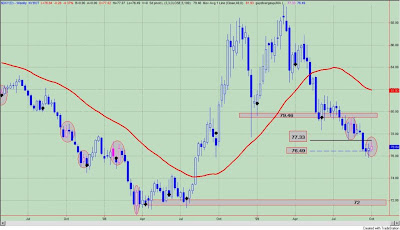
So what is the big deal? Well our key asset, the Dollar Index, is forming a positive divergence on the weekly charts. See figure 1, a weekly chart of the Dollar Index.

Figure 1. Dollar Index/ weekly

Positive divergence bars between a momentum oscillator that measures prices and price itself are highlighted by the pink prices within the gray oval. As can be seen, closes above these price bars led to an intermediate trend reversal or a close below the lows of these positive divergence bars resulted in an acceleration of the trend lower.

So with the positive divergence in place on the weekly, a close above the highs (77.33) of this price bar would result in the down trend being stymied. A close below the lows (76.49) of this positive divergence bar would likely result in an acceleration of the downtrend as traders cover their losing positions. (Anecdotally, much of my email recently has suggested that many traders are positioned for a reversal in the Dollar Index, so we shall see if "this time is different".) In any case, this acceleration of prices could come to fruition as there is very little support between current prices and the lows seen in April, 2008.

Lastly, a weekly close above the pivot low point at 79.46 would likely result in a new up trend.

And one final note: The Dollar Index -that same key asset to follow - that has been driving returns in both equities and commodities is down today. Surprisingly, equities are down too. Commodities will remain the beneficiary of a falling Dollar. Equities should start to struggle in such an environment as inflationary concerns (real or perceived mount) and the notion that no country has ever devalued its way to prosperity takes hold.

Sunday, September 27, 2009

Investor Sentiment: A Pullback Would Be Healthy

A pull back should be viewed as healthy within a strongly trending market. However, the "moon shot"rally that started in July, 2009 has been characterized by nary a pullback, so the current 2.2% drop in the S&P500 must be producing a little bit of angst amongst the bulls. Relative to the past 2 months, a 2.2% drop counts as deeply oversold. But really, very little has changed. The major indices are still within ascending channels. Investor sentiment remains extremely bullish. As I have been stating for several months now, there is an upward bias until the extremes in bullish sentiment are unwound.

The "Dumb Money" indicator is shown in figure 1. The "Dumb Money" indicator looks for extremes in the data from 4 different groups of investors who historically have been wrong on the market: 1) Investor Intelligence; 2) Market Vane; 3) American Association of Individual Investors; and 4) the put call ratio. The "dumb money" remains extremely bullish.

Figure 1. "Dumb Money" Indicator/ weekly

The "Smart Money" indicator is shown in figure 2. The "smart money" indicator is a composite of the following data: 1) public to specialist short ratio; 2) specialist short to total short ratio; 3) SP100 option traders. The "smart money" is neutral.

Figure 2. "Smart Money" Indicator/ weekly

Company insiders continue to sell shares to an extreme degree. See figure 3, a weekly chart of the S&P500 with the Insider Score "entire market" value in the lower panel.

Figure 3. InsiderScore Entire Market/ weekly

Figure 4 is a daily chart of the S&P500 with the amount of assets in the Rydex bullish and leveraged funds versus the amount of assets in the leveraged and bearish funds. Not only do we get to see what direction these market timers think the market will go, but we also get to see how much conviction (i.e., leverage) they have in their beliefs. Typically, we want to bet against the Rydex market timer even though they only represent a small sample of the overall market. As of Friday's close, the assets in the bullish and leveraged funds were greater than the bearish and leveraged by a ratio of 2 to 1; referring to figure 4, this would put the green line greater than red line.

Figure 4. Rydex Bullish and Leveraged v. Bearish and Leveraged/ daily


WealthTrack: Interview With Yale's David Swenson (Part 2)

This is the second part of the WealthTrack interview with Yale's David Swenson recorded in July, 2009.

He discusses the causes of the financial crisis, an "all weather" portfolio, TIPS and emerging markets.

Part 1 can be found at this link.


Friday, September 25, 2009

Inflation Pressures Fall

That was quick.

Last week I wrote about our inflation indicator ,which is derived from the trends in gold, crude oil and yields on the 10 year Treasury, moving into the extreme inflation zone and how this would be a headwind for equities. Bingo! Equities are having their worst week in a while. (They actually do go down.)

Anyway, the trend in crude oil has come off quite a bit and Treasury yields are heading lower as well. In other words, one week later our indicator is neutral; it is not below (but approaching) the low inflation line.

We can remove the inflation concern -real or perceived- from our list of worries.

Here is the indicator. See figure 1 a weekly chart of the S&P500.

Figure 1. S&P500/ weekly

Rydex Market Timers: All In

Yesterday's mini sell off has brought out the dip buyers. At least this is what we can infer from our Rydex market timers.

Figure 1 is a daily chart of the S&P500 with the amount of assets in the Rydex bullish and leveraged funds versus the amount of assets in the leveraged and bearish funds; this data is hidden. The indicator in the lower panel measures the ratio of assets in the bullish and leveraged funds to the assets in the bearish and leveraged, and as of Thursday's close, this ratio was greater than 2 to 1. Since this bull run began in March, 2009, a ratio greater than 2 generally was a marker of a short term top - not a buying opportunity. The other times the ratio was greater than 2 to 1 are indicated by the gray vertical bars in figure 1.

Figure 1. Rydex Bullish and Leveraged v. Rydex Bearish and Leveraged/ daily

Not only do we get to see what direction these market timers think the market will go, but we also get to see how much conviction (i.e., leverage) they have in their beliefs. Typically, we want to bet against the Rydex market timer even though they only represent a small sample of the overall market.

Figure 2 is a daily chart of the S&P500 with the amount of assets in the Rydex Money Market Fund in the lower panel. When the money market fund is flush with cash, one can assume that the Rydex timers (like market participants in general) are fearful of market losses. From a contrarian perspective, these are good buying opportunities. When the amount of assets are low (like now), these market timers are all in; one should be on the lookout for market tops. There is little buying power left. As of Thursday's close, the amount of assets in the Money Market Fund was at its lowest value since the bull run began in March, 2009.

Figure 2. Rydex Money Market Fund/ daily

Thursday, September 24, 2009

Key Price Levels: Mission Accomplished

Now that the stock market has moved over 50% higher in the past 6 months, there are two words that would best describe where we are now: "mission accomplished". Of course, we all remember President George W. Bush in the early months of the Iraq War standing on the deck of a Navy ship with those two words emblazoned on a banner in the background. Little did we know, that "mission accomplished" really meant mission just getting started. In any case, I use those words because the Federal Reserve and Treasury have engineered a recovery and in particular, a stock market recovery, that has brought prices back to levels seen in early October, 2008 when Lehman Brothers collapsed sending the world economy into a tailspin (sic: sorry words of the "media").

Technically, this also seems to be case when looking at the major indices. Equities are not only back to the days when Lehman collapsed, but they are also filling the gap when the stock market (i.e., S&P500) fell over 18% in one week. It's "mission accomplished". The Fed has managed to bail out Wall Street again.

Please review the methodology and the significance of the key price levels by clicking on this link.

A weekly chart of the S&P Depository Receipts (symbol: SPY) is shown in figure 1. Prices almost filled the gap, and with the down sloping trend line drawn from the October, 2007 highs, it looks like the 108 to 110 area will be the highs and continue to provide resistance. For the record, the gap was not filled, and it only missed by a little more than 1.5 points. Let's call this "almost mission accomplished". On the downside, there is support at 100, but the best buying point would be at the 94.24 level or the July, 2009 breakout point which was from the very solid base formation. I would not be surprised to see the market correct to this area at some point as these "moonshots" that are fueled by short covering have a tendency to give back all their gains.

Figure 1. SPY/ weekly

A weekly chart of the Diamond Trusts (symbol: DIA) is shown in figure 2. Here the gap is far from being filled and prices have yet to get to the down sloping trend line. The gap will be filled at 103.09. For the DIA, it is "mission not accomplished", but when dealing with the stock market, nothing is ever perfect. 93.28 would be a mini pullback, and a better buying point would be a pullback to the 87.5 - 88.5 zone.

Figure 2. DIA/ weekly

Figure 3 is a weekly chart of the Power Shares QQQ Trust (symbol: QQQQ). Our relative strength leader the past 6 months, the QQQQ, has already broken out of its down trend from the October, 2007 highs. Prices have hit the resistance zone between 42 and 43.60; these are the levels seen at the time of Lehman's collapse. So this is "mission accomplished". Good job, boys! A mini pullback to 40 would keep prices within the up trend channel and above the negative divergence price bar (labeled with pink), which will tend to act as a support level. A better spot would be 36.72, which is the level seen in July, 2009 just prior to our short covering moonshot.

Figure 3. QQQQ/ weekly

Figure 4 is a weekly chart of the i-Shares Russell 2000 Index (symbol: IWM). The gap at 61.73 was filled and the down trend line has yet to be violated. Another "mission accomplished". The zone between 50 - 52 is the first area of support, but before thinking of that, it should be noted that IWM is still within an uptrend channel.

Figure 4. IWM/ weekly

Although it is too soon to call a top, it should be noted that there is significant resistance nearby and overhead in the major indices. It is "mission accomplished" as the market now approaches price levels seen at the time of the Lehman crisis. There probably is a lot of back slapping going around at the Fed and Treasury Department these days as the markets have risen on a flood of liquidity. Over $2 trillion dollars of US household net worth was created in the last 6 months. Wow! We even had President Obama taking a victory lap on all the talk shows this week. The Fed and Treasury Department have done a great job pulling it off, but somehow I have the feeling that 6 years from now we will look back at this time and say "that wasn't 'mission accomplished'; that was 'mission just getting started.'"

Tuesday, September 22, 2009

Ugh! I Should Have Known!!!

This comes from the Department of I Should Have Known. More specifically, this is the kind of thing you do on a slow Tuesday afternoon before a Fed announcement.

Over the past several months, I have commented that the market will have an upward bias with a bid under the market and that shorting the market beyond an hour would be a very difficult proposition. Observing the intraday price action of the S&P Depository Receipts (symbol: SPY) over the past several months, it seems to me that markets never sell off for more than hour before the buyers appear. Not having much to do today, I decided to see if my observations were correct, so I crafted a simple study.

Study

1) 60 minute prices bars on the SPY
2) study start date: March 6, 2009
3) entry: two consecutive price bars where close less than open then buy next bar at open
4) exit: first price bar where the close greater than open and where close greater than entry price then sell next bar at open
5) no stop losses utilized
6) did not account for slippage or commissions

In the study, there were 67 trades yielding 30 SPY points. Buy and hold since March 6, 2009 has netted 38 SPY points. There was only 1 losing trade, but this is what we would expect from strategy that sold on the first close greater than the entry price. The average length of time of each trade was 8 price bars. With this strategy you spent 45% of the time in the market. The equity curve for this strategy is shown in figure 1, and this basically reflects the strong up move over the past 6 months.

Figure 1. Study/ equity curve


Figure 2. is the Maximum Adverse Excursion (MAE) graph for study #1. MAE measures individual trade drawdown (x axis), and what we can see is that 57 out of the 67 trades from this strategy had an MAE or draw down of less than 1.5%. These are all the trades to the left of the blue vertical line.

Figure 2. Study/ MAE graph

In other words, my observation that this market hasn't stayed down for long is pretty much correct. Over the past 6 months, two consecutive closes below their opens (on a 60 minute bar chart of the SPY) has generally brought in the buyers. Furthermore, with the average trade only lasting eight 60 minute price bars, traders didn't have to wait long before being made whole again.

Monday, September 21, 2009

WealthTrack: Interview With Yale's David Swenson

I was recently introduced to "WealthTrack", a business program on public television hosted by Consuelo Mack. I watched several of the episodes and was totally impressed with Ms. Mack and the caliber of her guests. More importantly, Ms. Mack asks the right questions and lets her guests talk. Ms. Mack is more concerned with her guests approach to the markets and how they think about the markets as opposed to what they are buying today. It's not hype, which is refreshing, and I got at least one nugget of information out of each of the shows I watched today. This is good journalism.

Below is a video clip of Yale's David Swenson, which was broadcast in May, 2009. It is about 25 minutes in length. An important point for me was his distinction between liquid and ill-liquid assets, and despite diversification, it was the ill-liquid assets that caused problems for Yale's endowment in fiscal year 2008. Swenson also had positive comments regarding Treasury Inflation Protect Securities, which I have written about several times over the past month.


Inflation Pressures Rising Again

Several months ago I began to lay out an asset allocation road map. In a nutshell, the US Dollar remains the key asset to follow, and as long as the Dollar remains in a downtrend, then commodities should outperform equities with Treasuries bringing up the rear. In those articles, I never really stated why I like commodities over equities.

I think we can all agree (for now) that as the Dollar Index goes so go equities and commodities. If the Dollar goes down, the other two assets should go up. If the Dollar goes up, they go down (like today's action). But equities face another headwind, and it is inflation as measured by the trends in gold, crude oil and yields on the 10 year Treasury bond. When the trends in gold, crude oil and 10 year Treasury yields are strong, then equities should under perform, and this is why I see commodities outperforming over the long term. Both commodities and equities may sell off on Dollar strength, but until the trend of the Dollar is higher, then equities will continue to lag commodities as repeated spikes in inflation (real or perceived) over many months will eventually chip away at the gains made in equities.

For the record, I would not call a reversal of the intermediate downtrend in the Dollar Index until there is a weekly close above 79.46, and this may change depending upon this week's price action.

Figure 1 is a weekly chart of the S&P500, and the indicator in the lower panel is a composite indicator that assesses the strength of the trends in crude oil, gold, and 10 year Treasury yields. When the indicator is above the upper line (i.e., high inflation zone) that means that these trends are strong and inflationary pressures (real or perceived) are rising. Under this scenario, equities face a headwind and should under perform.

Figure 1. SP500 v. Inflation Indicator/ weekly

For those interested in exploring how (real or perceived) inflation pressures effect equities, as measured by our indicator, please check out this link. I designed a study that asked the simple question of how stocks performed when the indicator was in the high inflation zone as it is now. The results are enlightening and cover about 25 years of data.

On figure 1, the vertical gray lines highlight recent past extremes in the indicator. Of note, the 2009 extremes in the indicator occurred during the recent bull run. The first led to a 1 week sell off where the S&P500 lost 4.99%; this was from May 8 to May 15. The second saw the S&P500 go essentially flat line (i.e., it made a 1% gain in 6 weeks) from May 22 until July 3. Even during this bull run, strong trends in gold, crude oil, and 10 year Treasury yields have slowed the advance of stocks. And as a corollary to all of this, the markets found a short term bottom in mid-July once the indicator hit the low inflation line. See the gray oval in figure 1.

The bottom line: inflation pressures -real or perceived- do matter. Over the long haul in this environment of Dollar devaluation, commodities should out perform equities.

Sunday, September 20, 2009

Investor Sentiment: It's Odd, But True

Market participants remain all giddy about the bullish developments of the past months. Yet, one year ago, a level of 1200 on the S&P500 had everyone in a panic, and this was before a 20% two week plunge. On Friday, with the SP500 closing at 1068, everyone is now ecstatic and most investors see nothing but blue skies ahead even though the fundamental outlook is just as muddled as 12 months ago. It's odd, but true. Two different investor outlooks but essentially the same level on the S&P500. So what has changed?

Investors' perceptions. It's where we have been (S&P500 ~666), where we have gone (S&P500 ~1068) and how fast we have gotten there (over 6 months) that investors attach significance too. It's not the fundamentals. It's not the values. It's the change in price and the hope that the market is forecasting what most of us cannot see: a robust economic recovery.

I can understand the buying at the March, 2009 lows. There was a dislocation in the markets, investors were bearish (i.e., bull signal) and great values were to be had. This was the time to be bullish. I can understand the buying back in early July, 2009. This was likely due to short covering as traders expecting and positioned for the markets to rollover threw in the towel giving the markets much needed fuel to move higher. And I can even understand the buying now. The markets are in a strong up trend.

But to attach any significance to the market's current strength is wrong. It is just the same old story of fear and greed. The difference between March and now is that the party is getting very crowded, and when the punch bowl is taken away, most investors will have a difficult time finding the exits. Anecdotal evidence would suggest this is particularly so in a market driven by notions of "liquidity"; sell offs can be rather brisk.

None of this is to suggest that I see a sell off in the near future, but from this perspective, risk is rising. As I have been stating for several months now, there is an upward bias until the extremes in bullish sentiment are unwound. Shorting the major indices beyond 1 hour seems to be a difficult notion in this market.

The "Dumb Money" indicator is shown in figure 1. The "Dumb Money" indicator looks for extremes in the data from 4 different groups of investors who historically have been wrong on the market: 1) Investor Intelligence; 2) Market Vane; 3) American Association of Individual Investors; and 4) the put call ratio. The "dumb money" remains extremely bullish.

Figure 1. "Dumb Money" Indicator/ weekly

The "Smart Money" indicator is shown in figure 2. The "smart money" indicator is a composite of the following data: 1) public to specialist short ratio; 2) specialist short to total short ratio; 3) SP100 option traders. The "smart money" is neutral.

Figure 2. "Smart Money" Indicator/ weekly

Company insiders have resumed selling of their shares to an extreme degree. See figure 3, a weekly chart of the S&P500 with the Insider Score "entire market" value in the lower panel.

Figure 3. InsiderScore Entire Market/ weekly

Figure 4 is a daily chart of the S&P500 with the amount of assets in the Rydex bullish and leveraged funds versus the amount of assets in the leveraged and bearish funds. Not only do we get to see what direction these market timers think the market will go, but we also get to see how much conviction (i.e., leverage) they have in their beliefs. Typically, we want to bet against the Rydex market timer even though they only represent a small sample of the overall market. As of Friday's close, the assets in the bullish and leveraged funds were greater than the bearish and leveraged; referring to figure 4, this would put the green line greater than red line.

Figure 4. Rydex Bullish and Leveraged v. Bearish and Leveraged/ daily

Friday, September 18, 2009

The Dollar Index: The Trend Is Your Friend

In identifying the Dollar Index (symbol: $DXY) as the key asset class to watch, I relied upon two strategies for guidance to make the call on June 19, 2009 that that this was a "Very Dangerous Time For The Dollar Index". So far, things are working out as expected.

The first strategy sold the Dollar Index short on any close below 3 pivot low points. Positions were covered on a close above 3 pivot lows or a close greater than the 40 week moving average. The second strategy sold the Dollar Index short on any close below a positive divergence bar. Positions were covered on a close above a positive divergence bar or a close above the 40 week moving average. In both strategies, weekly data were utilized.

Both strategies identified price patterns that suggested the Dollar Index would fall and there would be a high likelihood that that fall would be significant. In the first strategy, the average trade lasted 23 weeks, and in the second strategy the average trade lasted 14 weeks. The discrepancy in the average trade length was due to the fact that prices really accelerated lower on closes below positive divergence bars as traders looking for a bottom throw in the towel to cover losing positions. This trade or the second strategy made its gains, which were almost equal to strategy 1, over a much shorter time frame.

With regards to the first strategy (i.e., close below 3 pivots), the sell signal has been in effect for 8 weeks. For the second strategy (i.e., close below positive divergence) the sell signal has been in effect for 4 weeks. So what is my point? This weak dollar trade has yet to reach an average duration in time. In the Dollar Index, the trend is still your friend until it ends.

Reinforcing this notion that the down trend in the Dollar Index could persist for longer than most expect, there is an editorial from Bloomberg entitled, "Hedge Funds' ATM Moves From Tokyo to Washington: William Pesek". The writer basically argues why the Dollar Index will remain lower than many of us think. Essentially, a higher Dollar risks another episode of deleveraging. As Pesek points out:

"Think about the turbulence that would be unleashed by the dollar suddenly shooting 5 percent or 10 percent higher with untold numbers of traders around the globe on the losing side of that trade. It could make the “Lehman shock” look manageable."

In essence, the Federal Reserve and Treasury have a lot at stake and will likely continue the policy of devaluing the Dollar.

I want to thank Trader Mark at FundMyMutualFund for bringing this article to my attention.